Dashboard overview
In this Dashboard Overview, we will walk you through the key features and functionalities of KloudManage. Whether you’re a network administrator, an IT professional, or a business owner, this guide will help you navigate the dashboard with confidence, allowing you to tailor your KloudPortal experience to meet your organization’s unique needs.
There are 2 types of dashboards available.
- Main account level
- Venue level
Main account level dashboard.
1. The captive portal main account level dashboard is a powerful tool that enables you to collect and view information from all venues using the captive portal. This dashboard is designed to provide you with an overview of your entire network and allows you to view data from all locations in one place. By collecting information from the captive portal of all venues, the dashboard provides you with valuable insights into the performance of your network and helps you make informed decisions to improve user experience.
2. To access the Main account level dashboards, follow these simple steps:
Step 1: Log in to your KloudManage account.
Step 2: Click on the captive portal menu.
Step 3: The main account level dashboard will immediately open.
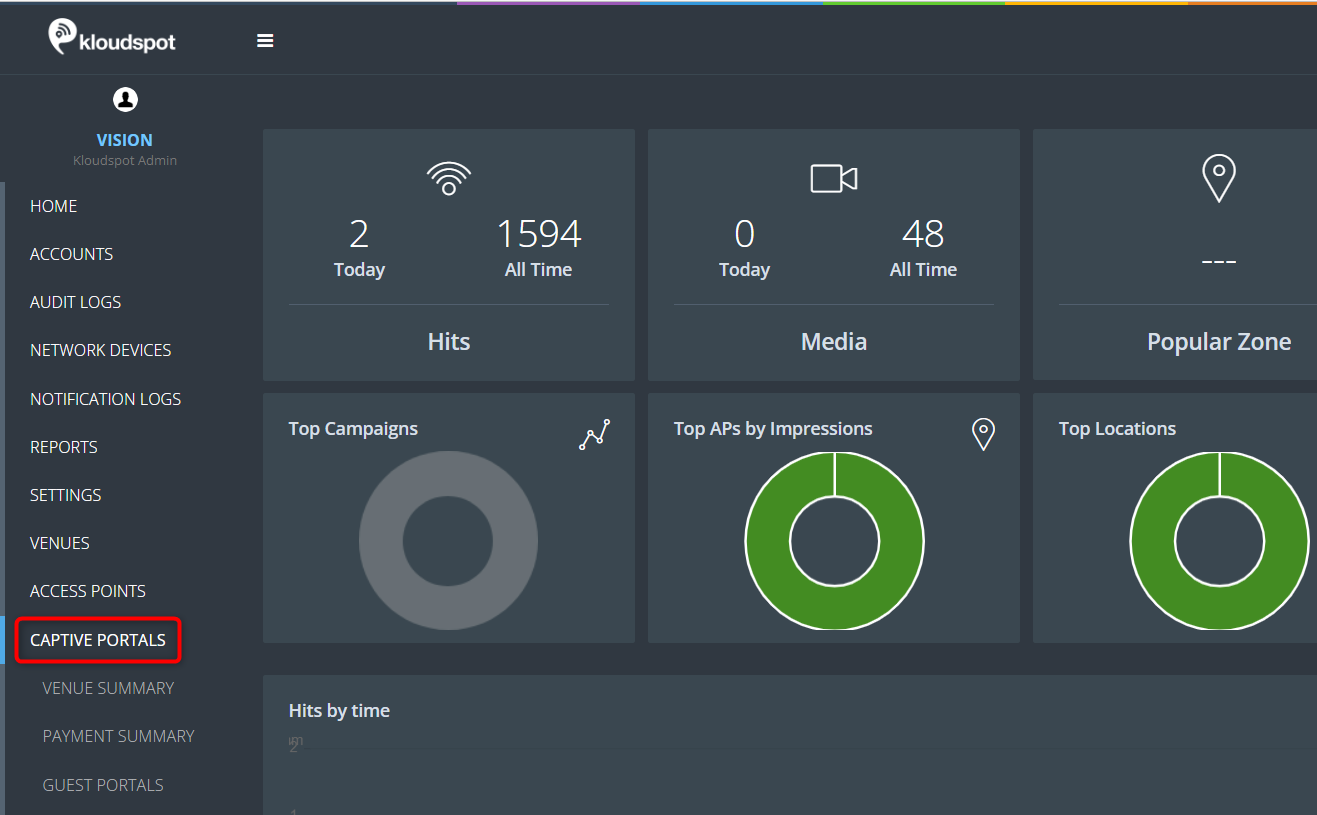
3. Once you have access to the Captive portal menu, you will see several dashboards that contain important information.
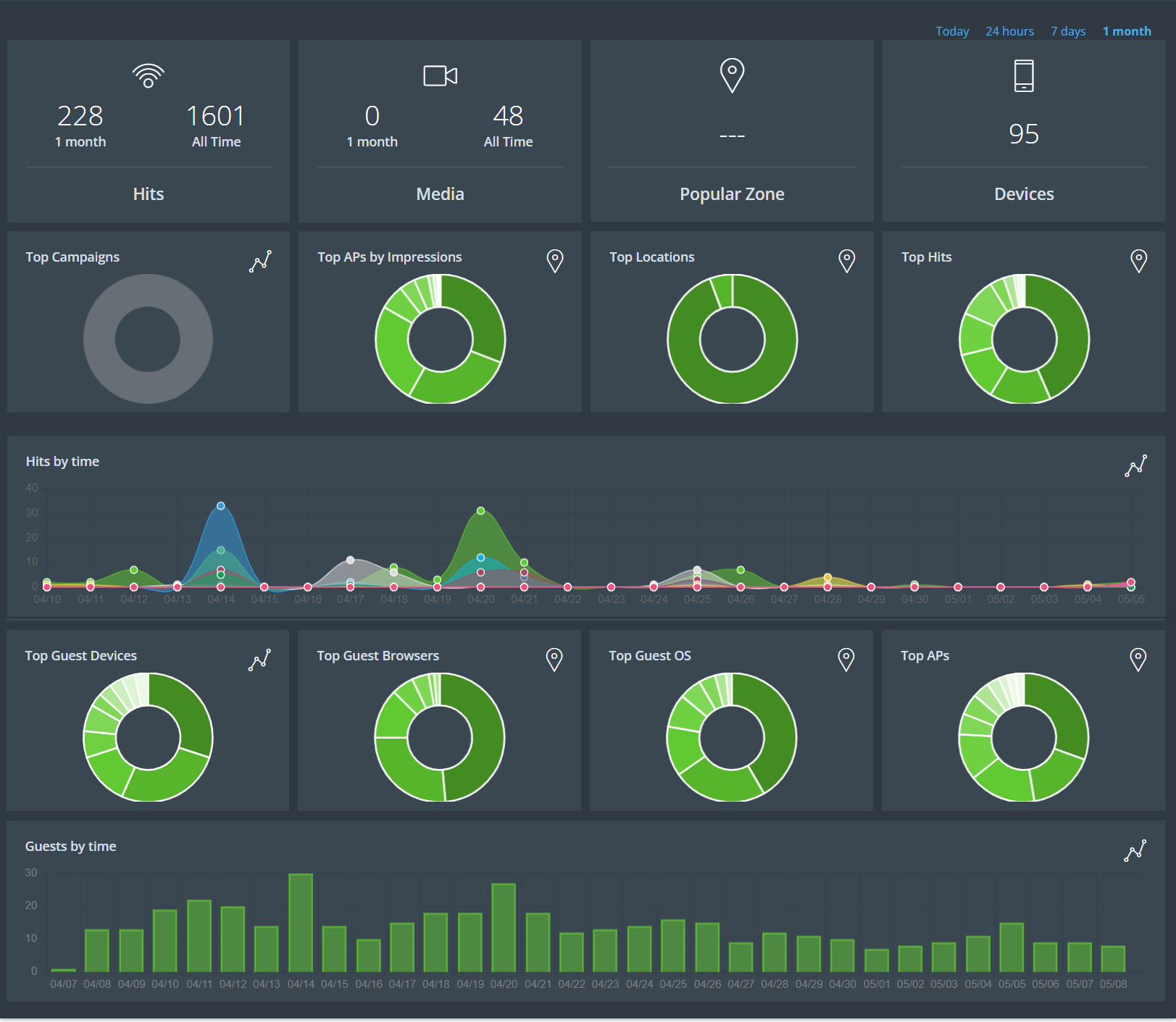
4. The information displayed in this section pertains to the main account level. In other words, the dashboard data shown here are based on information collected from all locations.
5. Here is a brief explanation of each section:
Hits: This section shows you how many people have connected to the captive portal today and how many people have connected to the portal so far. This information is updated in real-time, so you can track the number of hits as they happen.
Media: This section shows you how many media campaigns are currently running and how many media campaigns have been run so far. This information can help you understand the effectiveness of your media campaigns and make improvements where necessary.
Popular Zone: This section shows you which venue has the most people using the captive portal. This information can help you optimize your network and ensure that you are providing the best possible experience to your users.
Devices: This section shows you how many devices are currently connected to the captive portal. This information can help you monitor your network and ensure that it is running smoothly.
Top Campaigns: This section shows you which campaigns have been viewed by the most people. This information can help you understand which campaigns are most effective and make improvements where necessary.
Top APs by Impression: This section shows you the most used access points in the form of a pie chart. This information can help you optimize your network and ensure that your users are getting the best possible experience.
Top Locations: This section shows you the location of the hits in pie chart form according to their usage.
Top Hits: Top Hits: This section shows you the most popular hits in the form of a pie chart. Hits refer to the number of times users tried to access the captive portal, including how many successfully connected, how many used authentication methods, and how many visited the landing page. This information can help you understand what your users are most interested in and make improvements where necessary.
Hits by Time: This section shows you the number of hits in the form of a line chart according to time. This information can help you understand when your network is busiest and make necessary adjustments.
Top Guest Devices: This section shows you the devices used by guests in pie chart form. This information can help you optimize your network and ensure that your users are getting the best possible experience.
Top Guest Browsers: This section shows you the browsers used by guests in pie chart form.
Top Guest OS: This section shows you the operating systems used by guests in pie chart form.
Top APs: This section shows you the most used access points in the form of a pie chart.
Guest by Time: This section shows you the number of guests in the form of a bar chart according to time. This information can help you understand when your network is busiest and make necessary adjustments.
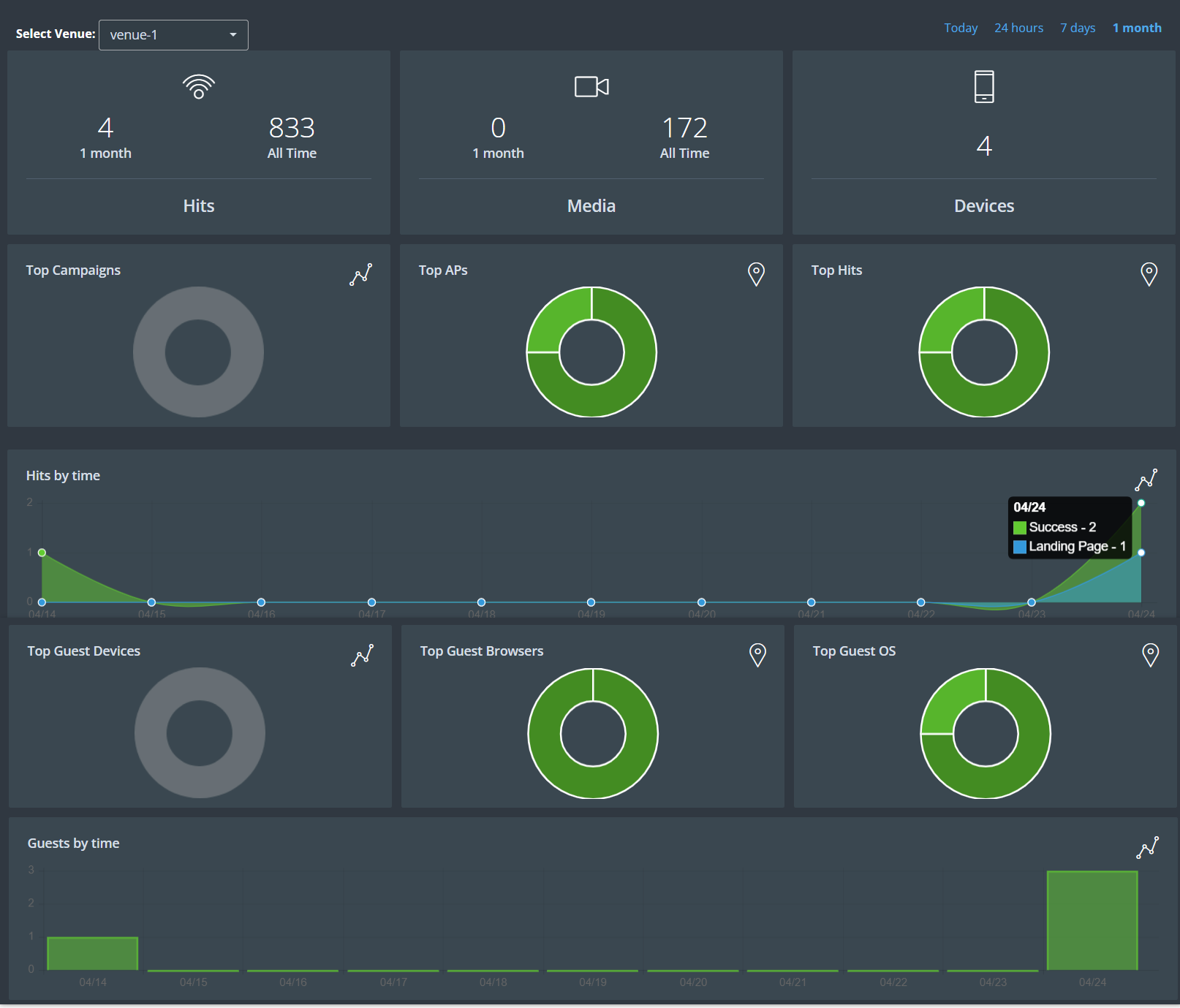
Venue level Dashboard
1. Venue-level dashboards provide specific information about the captive portal usage and performance of a particular location. These dashboards are designed to provide a detailed view of the captive portal activity at the individual venue level. By analysing this information, venue owners and administrators can gain insights into how their captive portal is being used, identify potential issues or areas for improvement, and make informed decisions about how to optimize their network performance.
2. To access the Venue level dashboards, follow these simple steps:
Step 1: Log in to your KloudManage account.
Step 2: Then navigate to the Captive Portal > Venue Summary.
Step 3: The Venue level dashboard will immediately open.
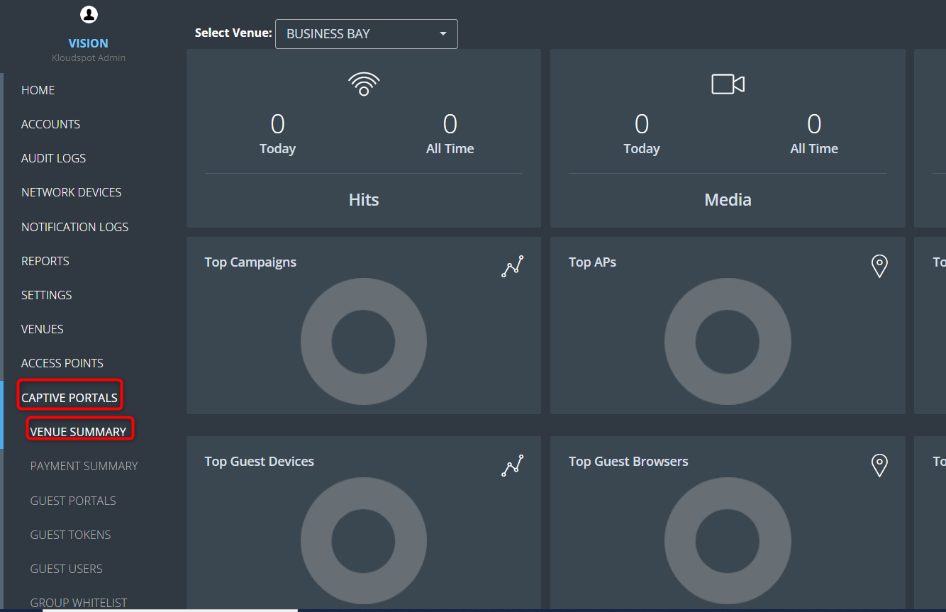
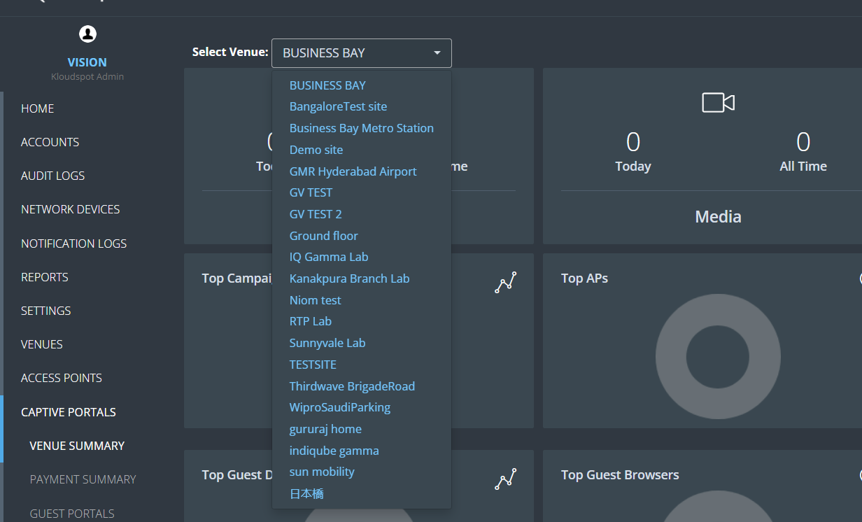
3. Once you have access to the Venue Summary, you will see several dashboards that contain important information. From here you can filter the dashboard by venue. For that select your desired venue from the venue dropdown list.
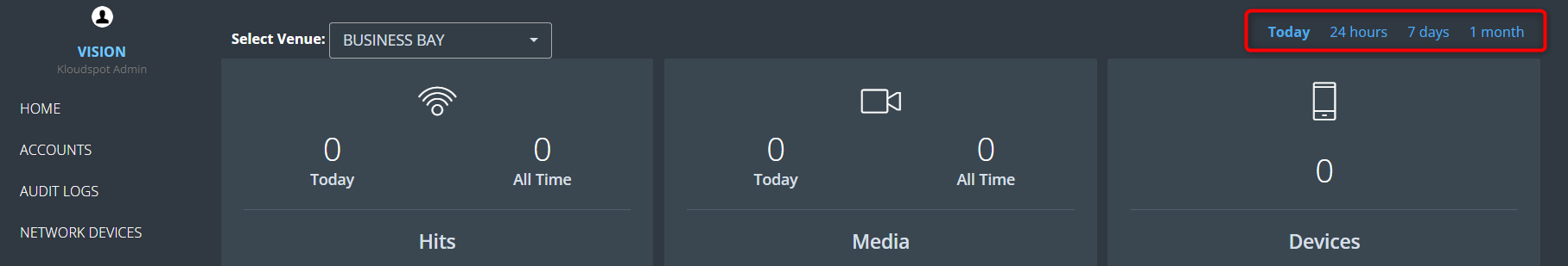
4. Then, choose the desired time frame to obtain the requested data. The available time intervals include options such as “today,” “24 hours,” “7 days,” and “1 month.”
5. Here is a brief explanation of each section:
Hits: This section shows you how many people have connected to the captive portal today and how many people have connected to the portal so far. This information is updated in real-time, so you can track the number of hits as they happen.
Media: This section shows you how many media campaigns are currently running and how many media campaigns have been run so far. This information can help you understand the effectiveness of your media campaigns and make improvements where necessary.
Devices: This section shows you how many devices are currently connected to the captive portal. This information can help you monitor your network and ensure that it is running smoothly.
Top Campaigns: This section shows you which campaigns have been viewed by the most people. This information can help you understand which campaigns are most effective and make improvements where necessary.
Top APs: This section shows you the most used access points in the form of a pie chart. This information can help you optimize your network and ensure that your users are getting the best possible experience.
Top Hits: Top Hits: This section shows you the most popular hits in the form of a pie chart. Hits refer to the number of times users tried to access the captive portal, including how many successfully connected, how many used authentication methods, and how many visited the landing page. This information can help you understand what your users are most interested in and make improvements where necessary.
Hits by Time: This section shows you the number of hits in the form of a line chart according to time.
Top Guest Devices: This section shows you the devices used by guests in pie chart form. This information can help you optimize your network and ensure that your users are getting the best possible experience.
Top Guest Browsers: This section shows you the browsers used by guests in pie chart form.
Top Guest OS: This section shows you the operating systems used by guests in pie chart form.
Guest by Time: This section shows you the number of guests in the form of a bar chart according to time. This information can help you understand when your network is busiest and make necessary adjustments.