Dashboards
Overview
To see the dashboard you made, simply click on “My Dashboard” in the menu. If you’d like to create a new dashboard, check out the Creating Dashboards section for guidance.
Widgets
Kloudspot Analytics offers a wide variety of widgets that users can pick and choose from to create a dashboard.
Analytics (1)
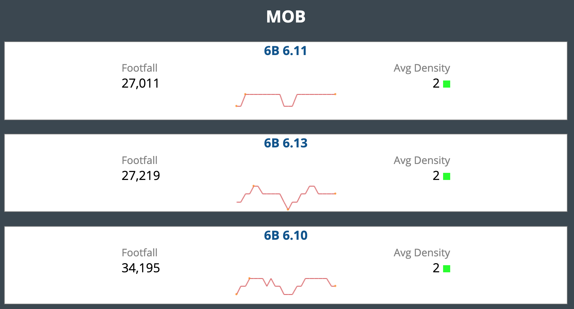
Footfall Density
A floor-by-floor statistical view of device density across a site
Footfall: The total number of devices that enter a physical space or location over a given period of time.
Avarage density is calculated per square area. These are further color-coded based on the density on the area or floormap. In configuration, we can predefine the color code (based on numerical measure) for Avarage density.
Here, density is divided into ranges and on the basis of those ranges, it is given tags like A , B, C , D , E .
Calendar (5)
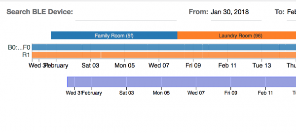
Bluetooth timeline
This widget is available only for Bluetooth devices.
This widget gives a timeline view of user dwell times at a given location.
We can search for devices (using a Mac address or name) connected via Bluetooth. You can select a date range (duration of 7 days) to monitor and analyze the user engagement in different zones on a site.
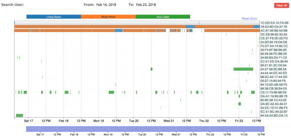
User timeline
This widget is available for Wi-Fi devices.
We can search for devices connected via Wi-Fi. You can select a date range (duration of 7 days) to monitor and analyze the user engagement in different zones on a site.
This widget gives the timeline view of user dwell times at a given location.
Here we can add maximum 25 devices.
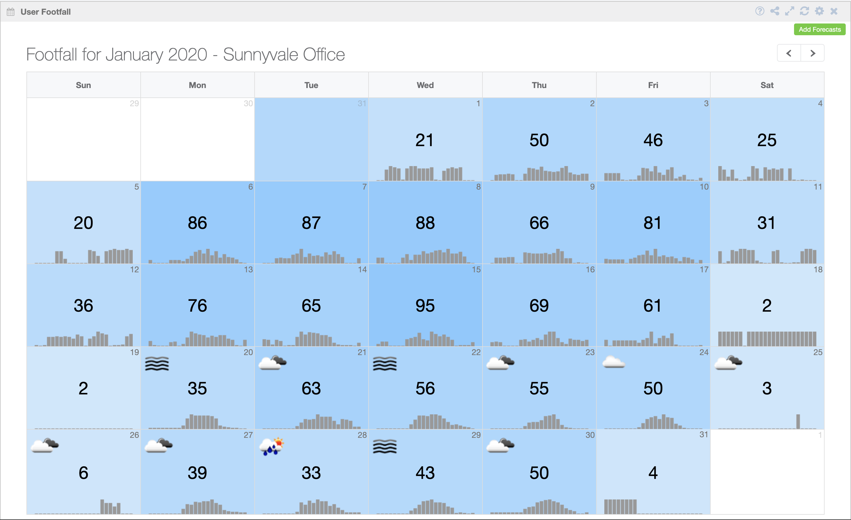
User Footfall
No. of unique devices seen on the site per day in given period of time for the selected location. This calendar also shows the weather information.
In the settings menu, we have options of selection between 2 devices that are Wi-Fi device and Bluetooth device.
In setting, we also have option “Attributes” selection functionality which basically filters users/ client on the basis of field selected.
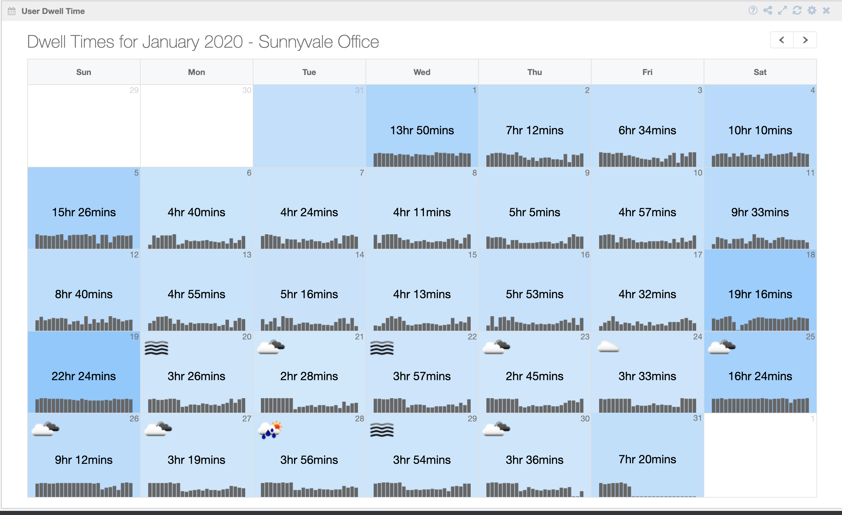
User Dwell Time
This shows the Avarage dwell time spent by unique devices on the site per day along with weather information shown in the calendar view.
Here in settings, we have the option of “Dwell type” that has “Average Dwell Time” and “Average Visit Length” (please select one).
Average Visit Length: it shows average of the amount of time user spends in a given location in given time interval divided by Number of times user visit a location in given interval.
In the settings,
- there are options available to select the device type in the settings options, i.e either a Wi-Fi device or a Bluetooth device.
- Option available for “Attributes” selection functionality, which basically filters users or client on the basis of field selected.
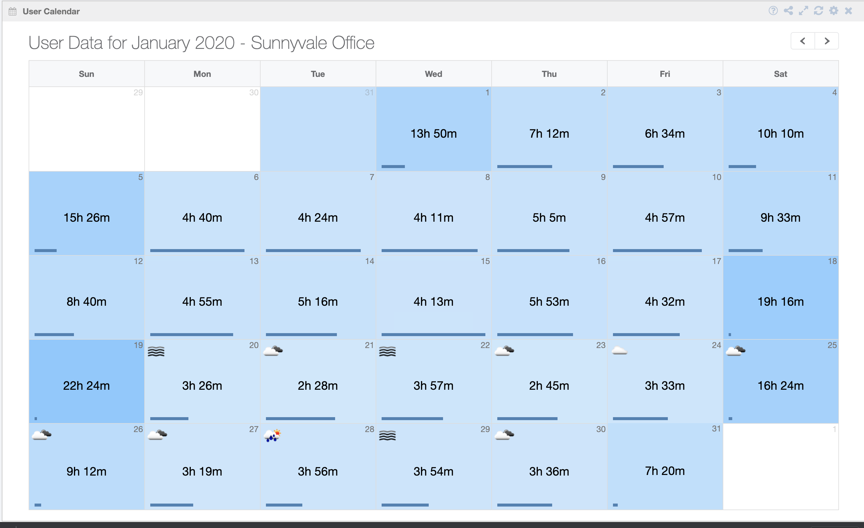
User Calendar
This widget gives information about both the “User Footfall” and “User Dwell Time” per day.
This widget shows the calendar view of both “User Footfall” and “User Dwell Time”.
In the settings,
- There are options available to select the device type in the settings option, i.e either WIFI Device or Bluetooth device.
- Option available for “Attributes” selection functionality, which basically filters users or client on the basis of the field selected.
Maps (20)
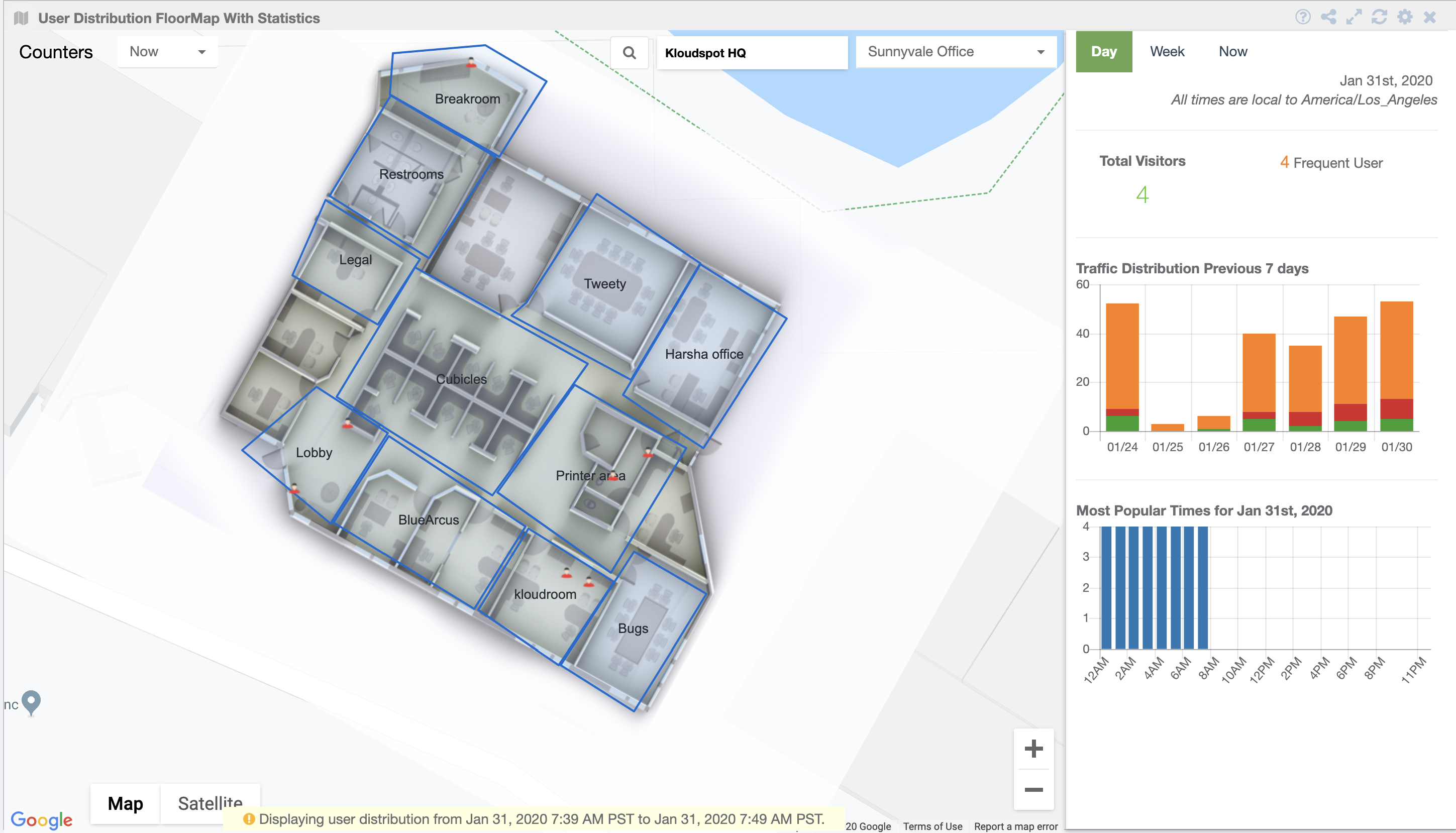
User Distribution FloorMap With Statistics
The widgets show the users present in different zones on the floormap. It also shows additional data w.r.t the total visitors per day, as shown in figure below.
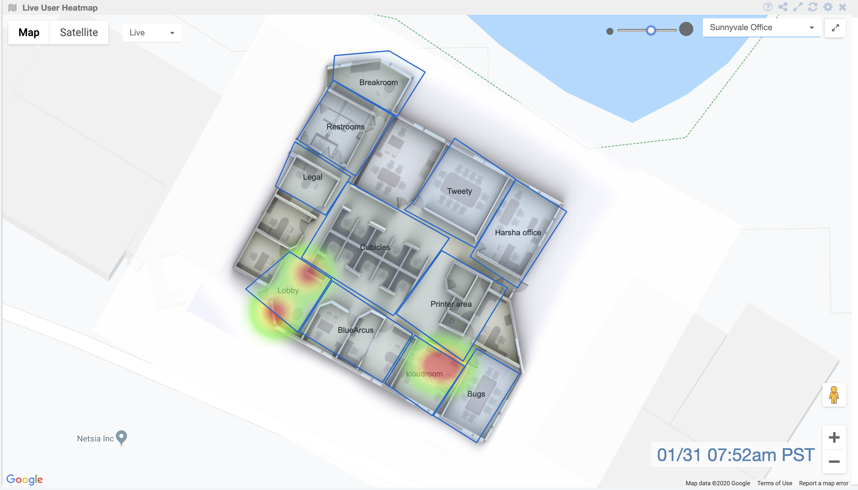
Live User Heatmap
The presented widget is designed to visualize user footfall and density at a specific location. It includes various options to enhance the user experience and analysis:
-
Heat Map: This feature illustrates the density of users on the map, with high-density areas shown in red.
-
Zone Capacity: The floor map can be segmented into different zones, allowing users to examine footfall within specific areas.
-
Zone Capacity Key: This section provides percentage ranges (A, B, C, D, E, F) along with corresponding colors, representing different levels of user density in the zones.
-
Refresh Interval (sec): Users can set a time interval to automatically update the widget’s data, ensuring real-time information on user footfall.
-
Include Tags: This filtering option enables users to view footfall data for specific user groups based on tags, such as VIPs, staff, or students.
-
Exclude Tags: Similarly, this option allows users to filter out data for certain user groups, providing more focused footfall analysis.
-
Floor Switching: In case the location has multiple floors configured, users can easily switch between floors to analyze footfall on different levels of the building.
Overall, this versatile widget provides valuable insights into user footfall and density across the location while offering flexible customization options to cater to various analysis needs.
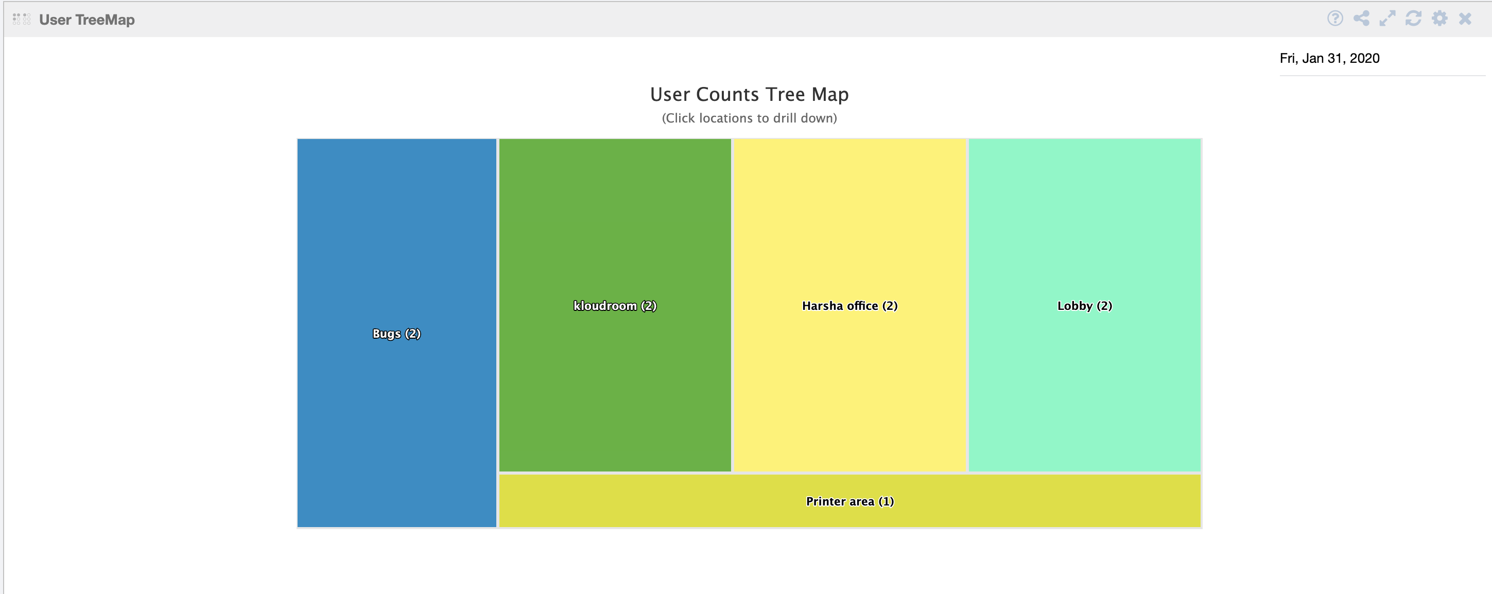
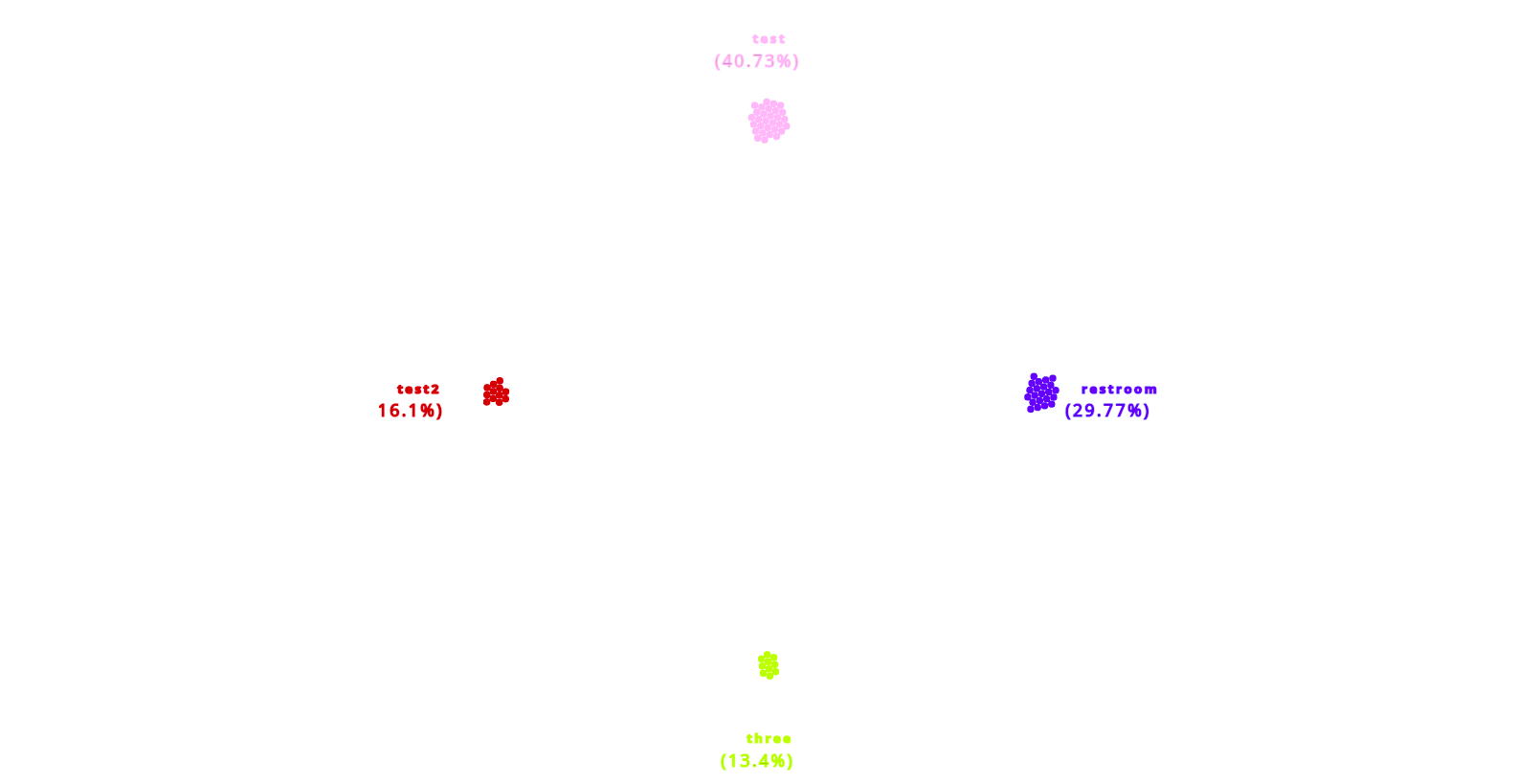
User TreeMap
In settings, select options for either Wi-Fi device or a Bluetooth device.
The user treemap shows the user count on each zone configured across the floormap and its children on the basis of date we select.
We can see the user count of all divisions if we have more divisions on the floormap.
In settings, we also have the option “Attributes” selection functionality, which basically filters users or client on the basis of the field selected.
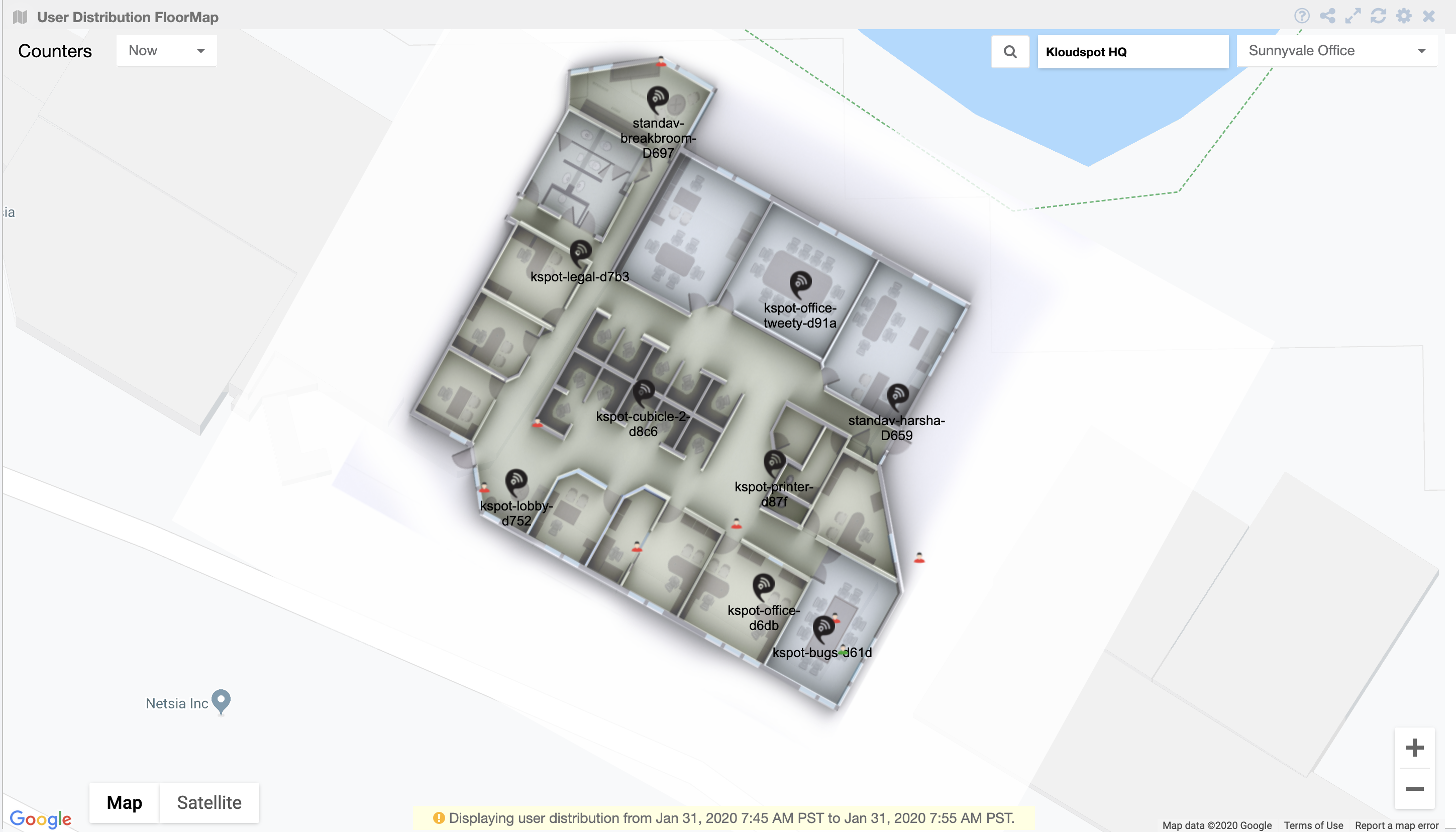
User Distribution FloorMap
This is a view of different users present on the floormap based on different parameters available in the search functionality options on this widget like floormap, zones, heat map, access points, connected users, probing users, bluetooth users, geolocated users only, group zone users, exclude passerbys.
In setting, we have option of “Refresh Interval(sec),” which refreshes the widget on the basis of given time interval.
We also have the option of “include tags”, that filters on the basis of some tags and also other option for “exclude tags”, that filters on the basis of the same tags that are in the include tags.
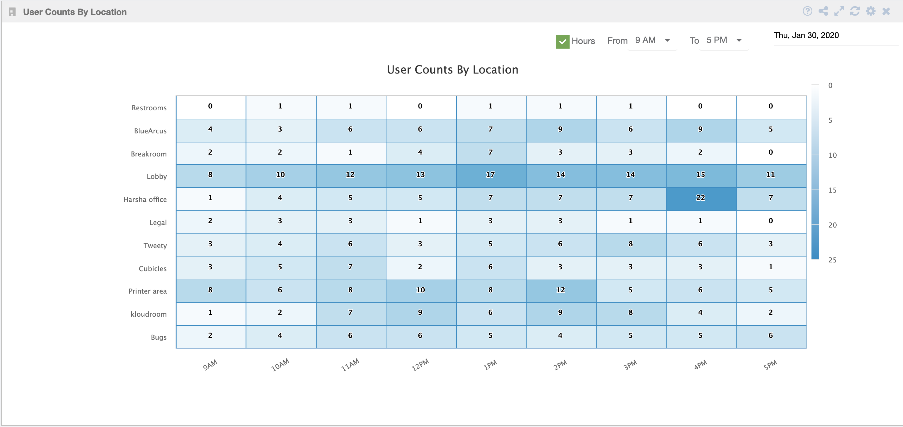
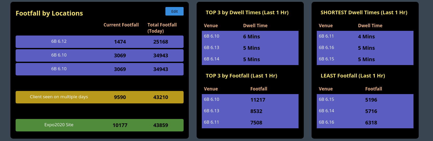
User Counts By Location
In settings, select options for either a Wi-Fi device or a Bluetooth device.
This table shows the number of users seen at every zone on a selected date. You can also select the time range to get more detailed information on the footfall count.
Here are options available for “from date” and “to date” which takes dates input in the range of 7 days for which we want to see the user counts.
The “Filter Zones” dropdown allows us to filter locations for which we want to see user counts. The selection of “hours” gives user counts for particular hour range. However, by default, it gives user counts for whole day (24 hours).
In settings, we also have the option “Attributes” selection functionality, which basically filters users or client on the basis of field selected.
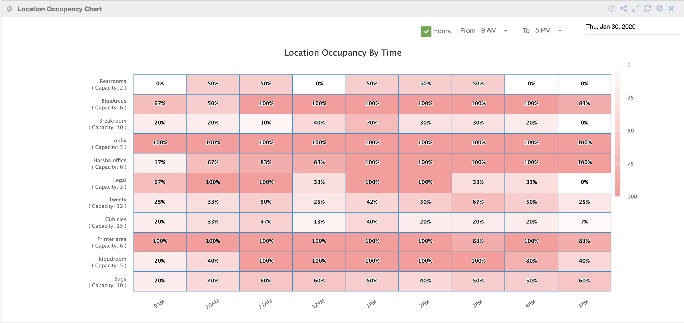
Location Occupancy Chart
The “Location Occupancy Chart” is a representation that provides an overview of the occupancy status of each zone within a specific location. This chart displays the occupancy on an hourly basis as a percentage of the total capacity for each zone, giving users a quick and clear understanding of how full each area is.
Important Features of the Location Occupancy Chart:
-
Zones: Each zone within the location is listed on the chart, along with their respective capacities. This information allows users to know the maximum number of users that can be accommodated in each area.
-
Occupancy Percentage: The chart shows the current occupancy of each zone as a percentage of its total capacity. This percentage is calculated by dividing the number of current users in the zone by its maximum capacity and then multiplying by 100.
-
Color Indicators: To provide a visual cue, the zones may be color-coded based on their occupancy status. For example, 0% indicates with no occupancy, and as percentage increase the color become darker. Making it easy to identify areas that are approaching or have reached their capacity.
By using the Location Occupancy Chart, users can make informed decisions regarding crowd management, resource allocation, and overall safety measures. It allows them to proactively address any potential issues related to overcrowding or underutilization in different zones, ensuring a smooth and optimized experience for all users within the location.
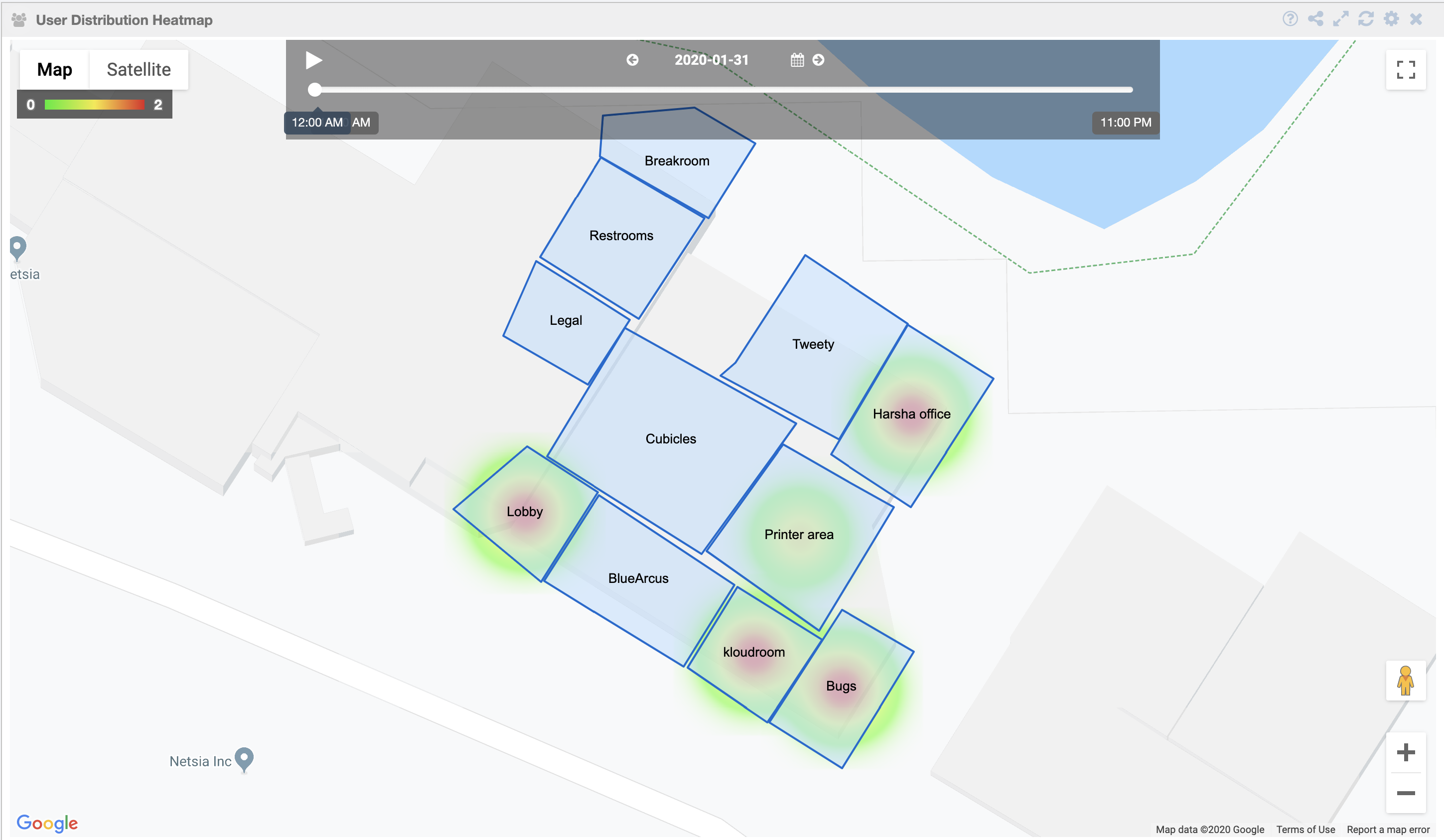
User Distribution Heatmap
This is a user distribution information, where you can view the user movements from one to another throughout the day.
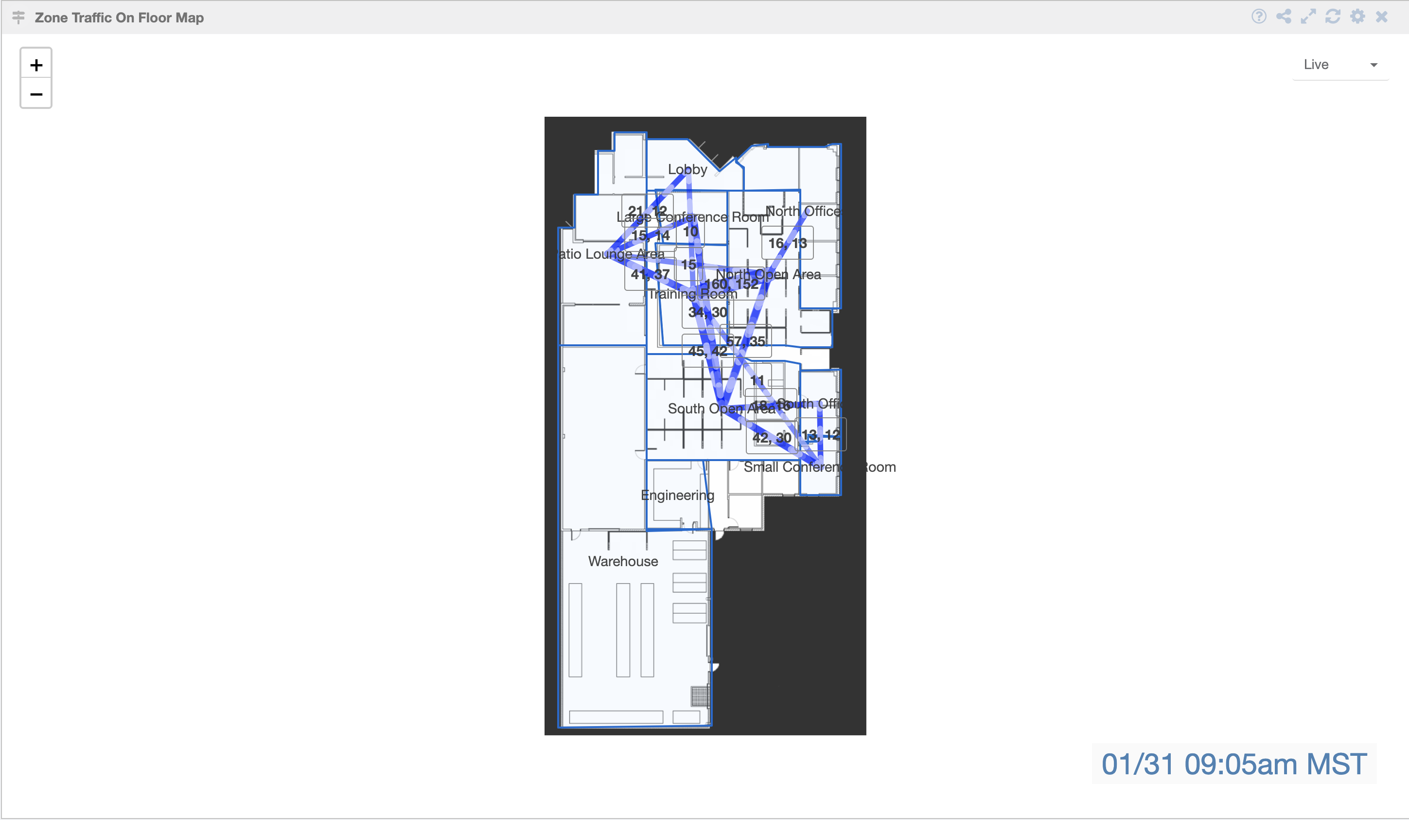
Zone Traffic On Floor Map
This widget shows the user flow/ traffic from one zone to another.
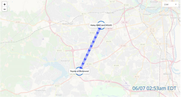
Site Traffic On Geo Map
The widget show the movement of users between different sites. It provides valuable insights into the flow of users from one site to another and allows users to monitor real-time traffic as well as view traffic data for specific dates using the “Live traffic” and “Custom” options.
Features of the Traffic Visualization Widget:
-
Traffic Flow between Sites: The widget presents a graphical representation of user traffic, showing the paths users take as they move from one site to another. This flow may be represented as arrows or lines connecting the sites.
-
Live Traffic: The “Live traffic” option enables users to view real-time data on user movement between sites. This provides an up-to-date and dynamic view of the current traffic patterns.
-
Custom Date Option: The “Custom” option allows users to select a specific date and view the traffic data for that particular day. This feature enables the historical analysis and comparison of traffic trends on different dates.
By using this Traffic Visualization Widget, users can gain valuable insights into user behavior, identify popular routes between sites, and make informed decisions regarding resource allocation and traffic management. The ability to view both real-time and historical data provides a comprehensive understanding of user movement patterns, helping to optimize operations and enhance the overall user experience.
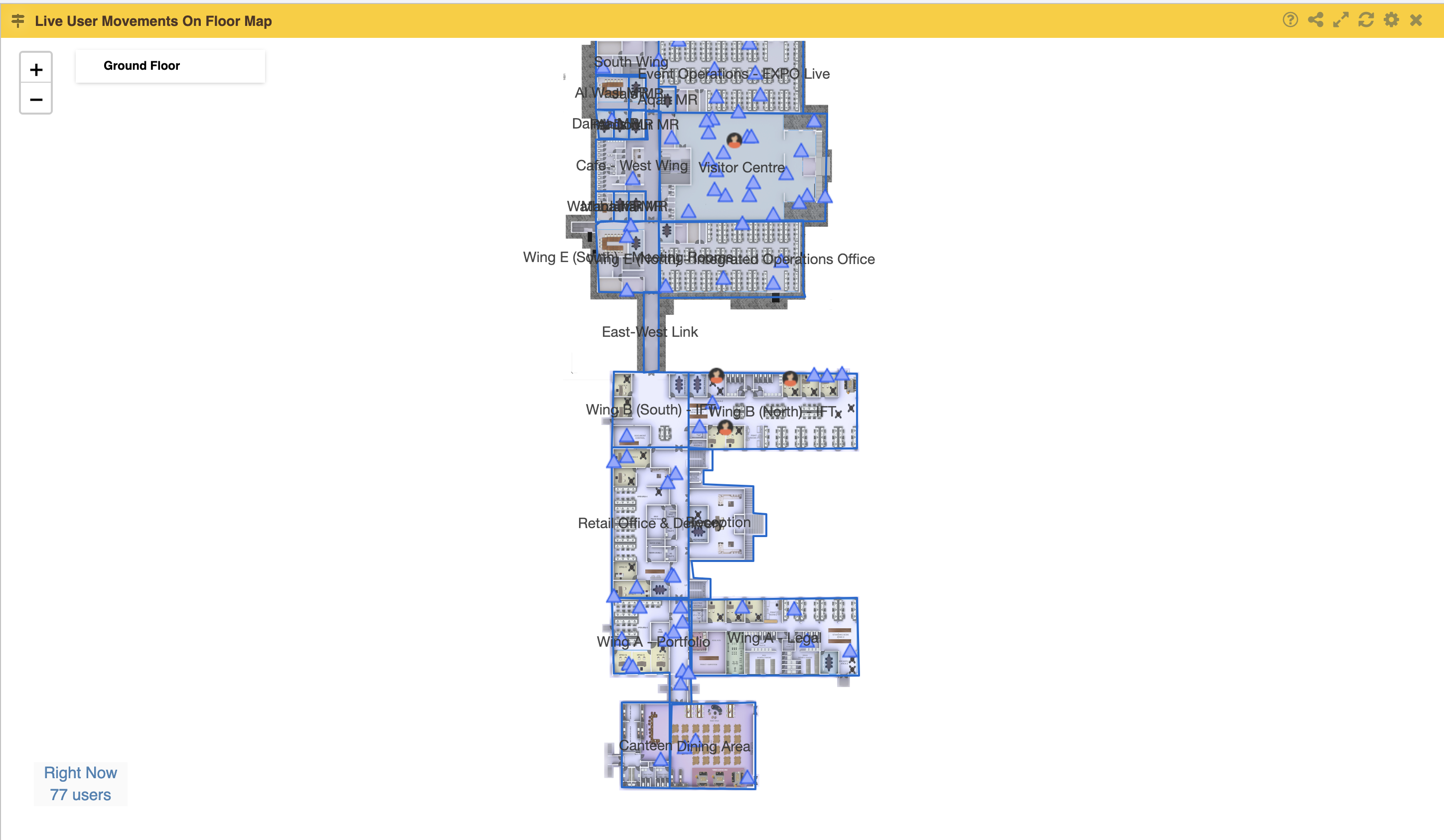
Live User Movements on Floor Map
The live user widget shows the live movement of a user on the entire floormap.
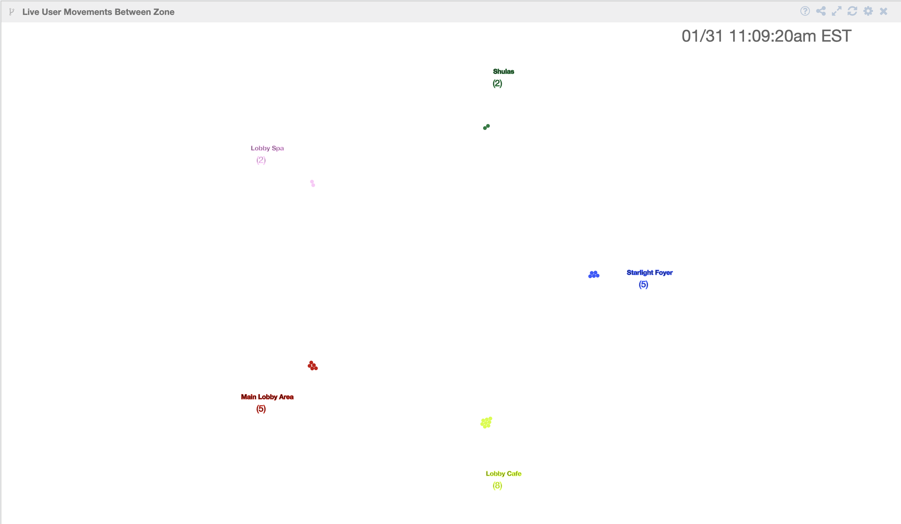
Live User Movements Between Zone
The widgets shows the count of user footfall in each zone on the floormap.
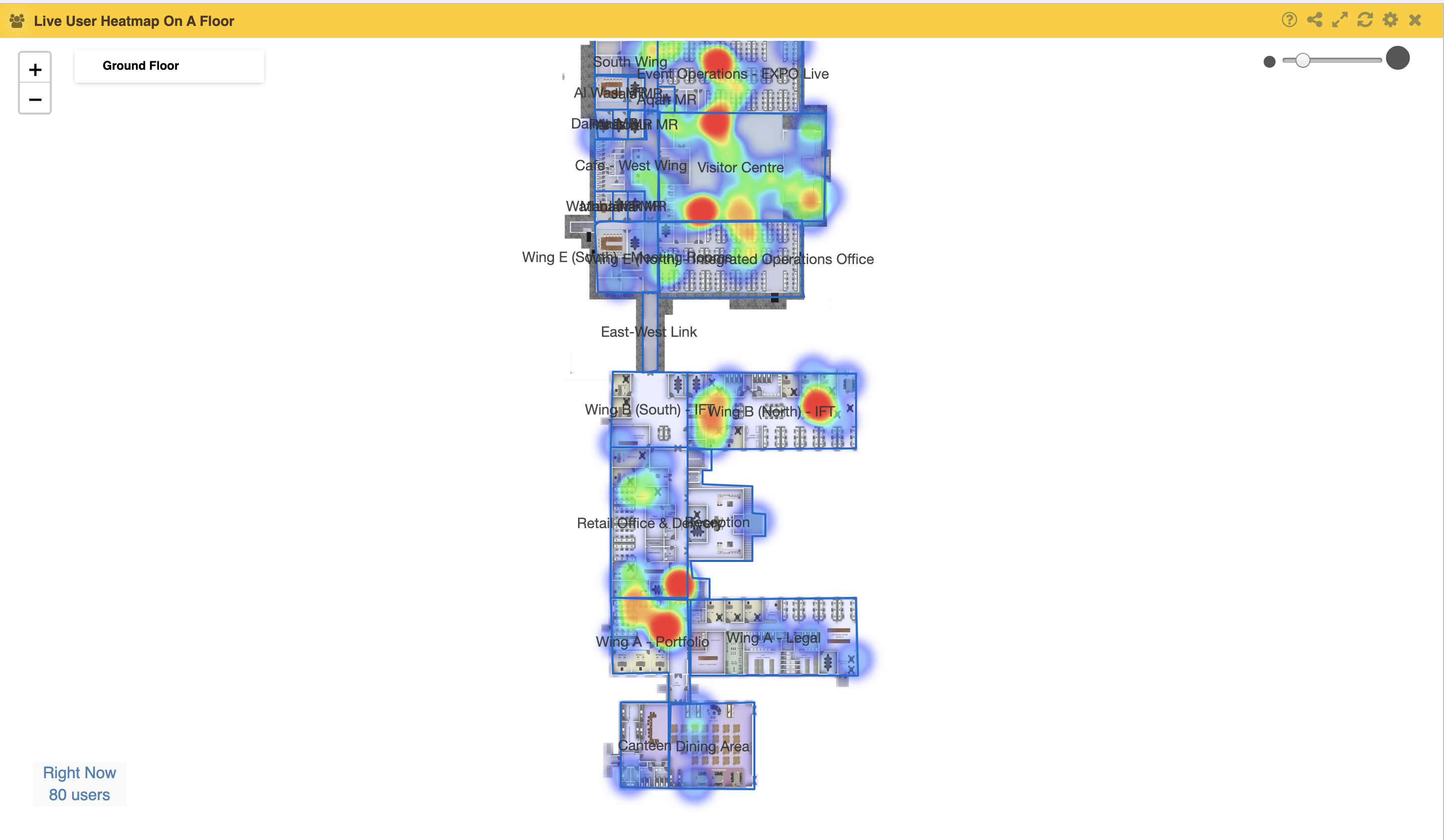
Live User Heatmap On A Floor
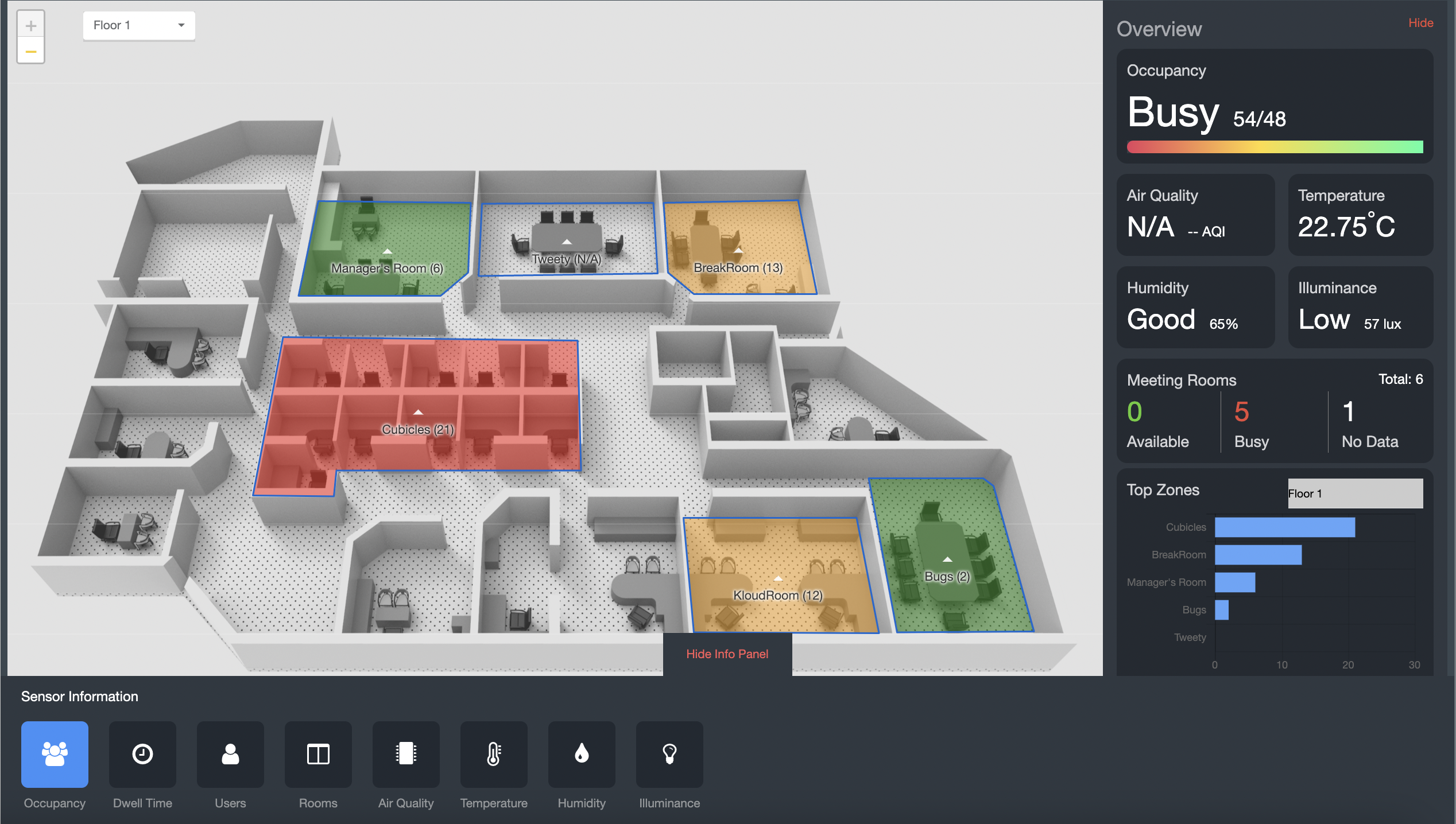
Multi Sensor heatmap
The Multi-Sensor HeatMap widget in the side panel is a powerful tool that allows users to gain a comprehensive overview of various environmental and occupancy metrics within a particular area or building. Here’s a breakdown of the features and information provided by the widget:
-
Occupancy: This shows the real-time or historical data on the number of people present in the monitored space. It helps in understanding the occupancy patterns and trends.
-
Air Quality Index: This displays information about the air quality index within the zone.
-
Temperature: This presents the current temperature in the monitored space. Temperature levels can affect comfort and energy efficiency, making it essential to keep track of them.
-
Humidity: This indicates the humidity levels in the area. Monitoring humidity is crucial for maintaining a healthy indoor environment and preventing issues like mold growth.
-
Illuminance: This refers to the measurement of light intensity in the monitored space. It helps in understanding the lighting conditions and may be important for tasks that require specific lighting levels.
-
Meeting Room Availability: This feature shows the availability status of meeting rooms, indicating whether they are vacant or booked. It helps in finding available rooms quickly.
-
Top Busy Zone: This heatmap highlights the areas within the space that are most occupied or frequently used. Identifying the most busy zones can aid in space planning and resource allocation.
Sensor Information: This section provides detailed information from individual sensors placed in various locations within the monitored area. The information may include:
-
Occupancy: Sensor data on the number of people in specific zones or rooms.
-
Dwell Time: The average time people spend in specific areas, helping analyze user behavior and space utilization.
-
Users: Information about individuals present in the space, possibly linked to their profiles or devices.
-
Room Heatmaps: Visual representations of occupancy patterns and heatmaps for different rooms, indicating popular or less-used areas.
-
Temperature and Humidity: Detailed readings of temperature and humidity from individual sensors.
-
Illuminance: Specific light intensity measurements from sensors.
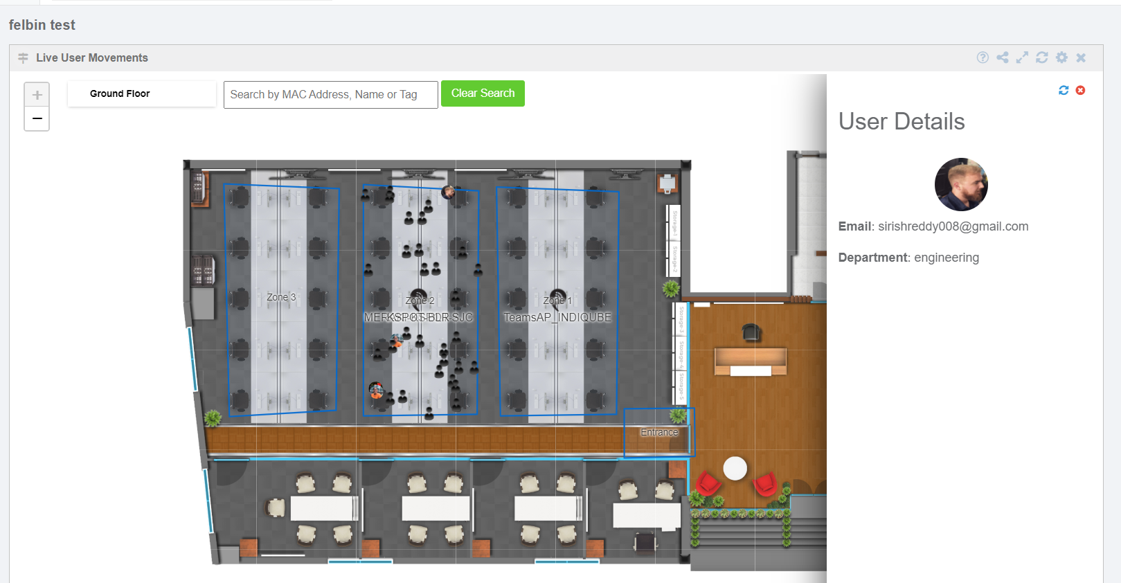
Live User Movements
Visualization displays user movements on a floor map in real-time on the basis of different parameters present in the search functionality for this widget, like zones, access points, probing users, Bluetooth users, exclude passerby, show movements, and heatmap.
This widget allows searching for particular user movements on the basis of a Mac address, name or tag.
The widget also consists of an option to “include tags” that filters on the basis of some tags and another
Option, which is “exclude tags” that filters on the basis of same tags that are in include tags.
Live User Path Movements
The live user path movement visualization widget is used for tracking and analyzing user activity on a floor map. It offers various features for customizing and filtering the displayed data. Let’s break down the main features of this widget. You can use filters like Zones, Probing Users, Bluetooth Users, and Exclude Passerby. Also, inside the bar you can filter the user as well.
Site Device Density Map
A consolidated view of device density across a site.
Live User Movements Between Zone Tags
In settings, select options for either a Wi-Fi device or a Bluetooth device.
This is a real-time visualization of user movement (in percentage) between zone tags on a selected location. Here we give some custom tags on zones and can view the user’s movements.
In this widget, we have the search filter “Filter Zones By Tags” and “Display Metric”.
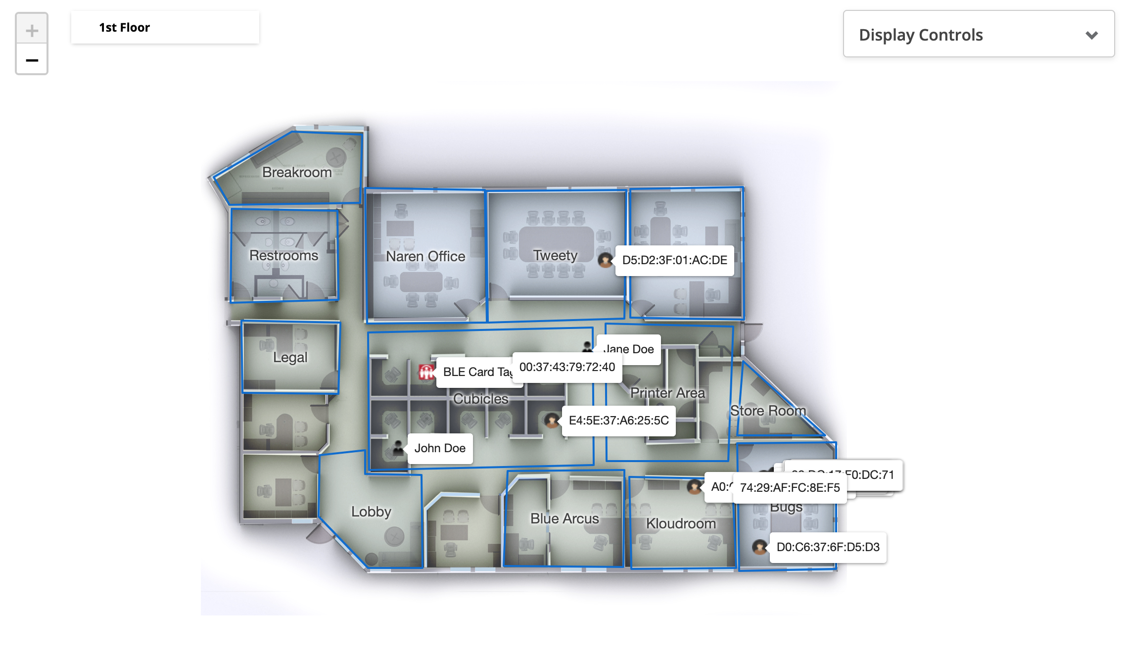
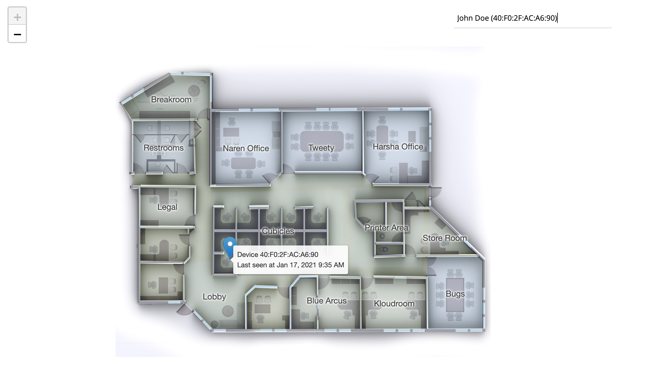
Last Known Location on FloorMap
Locate any wi-fi or bluetooth device by displaying the last known location on a floormap.
Here, we have “search user” functionality that allows to search a user by its name or just entering Mac address of the device to be looked for on the floormap.
Floormap Device Density
(..need to attach widget image)
A consolidated view of device density on a floormap
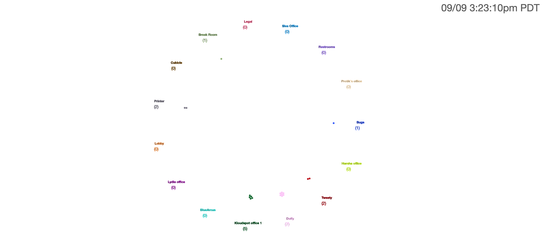
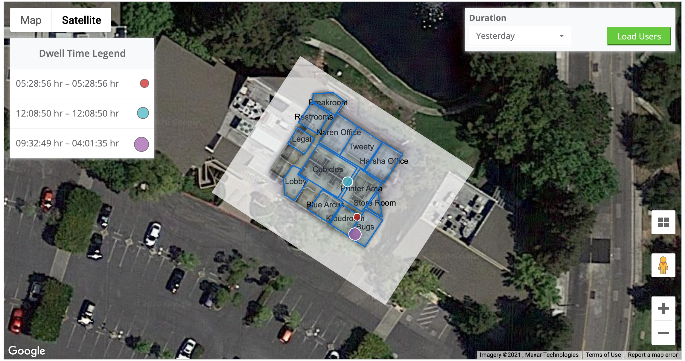
Dwell Time Map
This widget displays a map that shows users according to their dwell time on the basis of time intervals and shows the users on the map with different colours on the basis the given time intervals.
Dwell time is the amount of time that user spends in a particular location.
Allows you to select from “Map” view or “Satellite” view and in “Duration” we can select the options like “Today”, “Yesterday” and “Custom” to show users data accordingly. In “Custom” we can select date range (max upto 7 days) for users.
On filling in all the required details, click on “load users” which gives all users according to given time interval on the widget and on selected fields.
Matrix (2)
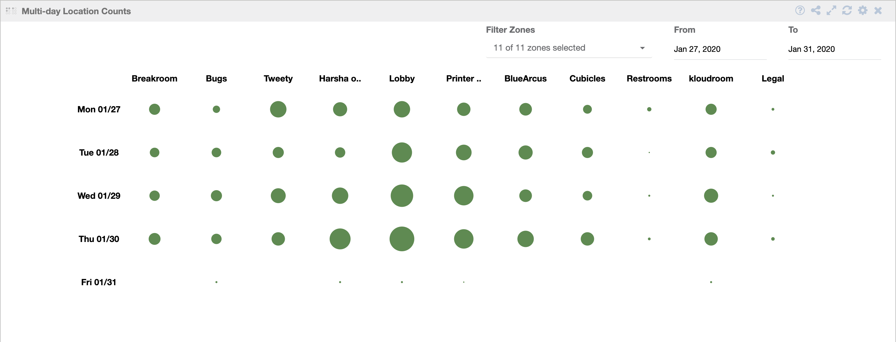
Multi-day Location Counts
Tabular representation of user distribution in different zones for the selected date range.
Others (7)
RSS Feed
Add any RSS Feed to your dashboard with ease.
Site Reporting Dashboard
Site Reporting Dashboard with Key Elements
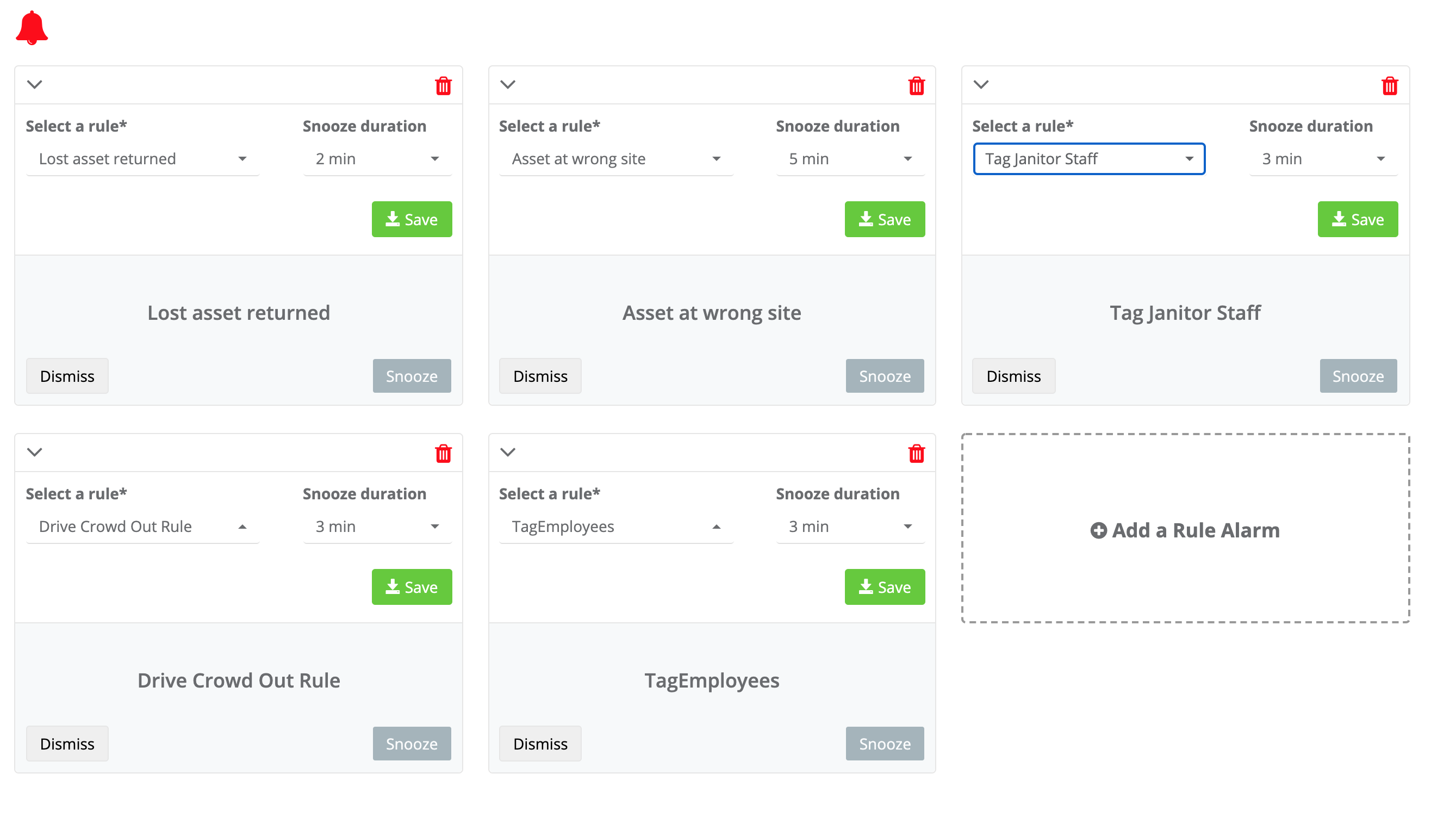
Rule Alarm
Display an alarm when a specified rule is triggered.
Cisco meraki Logs
(…need to attach widget image)
List of the each access points logs
Webpage
Add any external gadget/webpage to your dashboard with ease

Cisco Meraki clients details
List of the connected client devices for a specific network based on the SSID that was chosen.
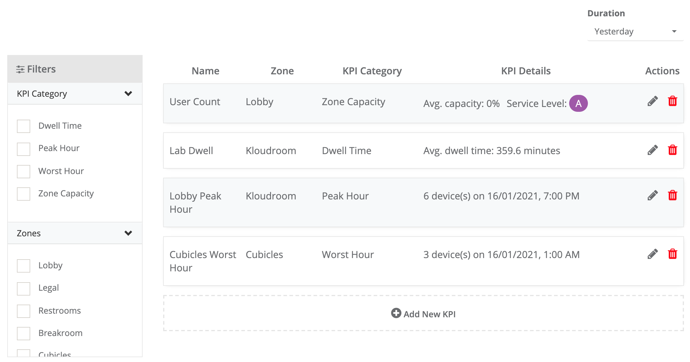
KPI
Display a list of KPIs for selected zones.
Path (7)
Path Distribution

Outbound User Traffic Flow
Path Distribution Matrix
Inter-Site Path Distribution
Inbound User Traffic Flow
Inbound User Traffic Flow
Outbound User Traffic Flow
Time (3)
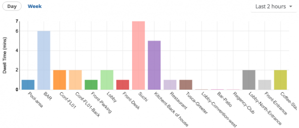
Dwell Time Chart
Dwell time information for each zone on the site.
Dwell Time Chart By Attribute
(…Need to attach widget image)
A bar chart that displays a distribution of all the venues with respective user dwell times.
Live Floor/Site Device Density
(…Need to attach widget image)
A Live Streaming Density of given Floor/Site
User (12)
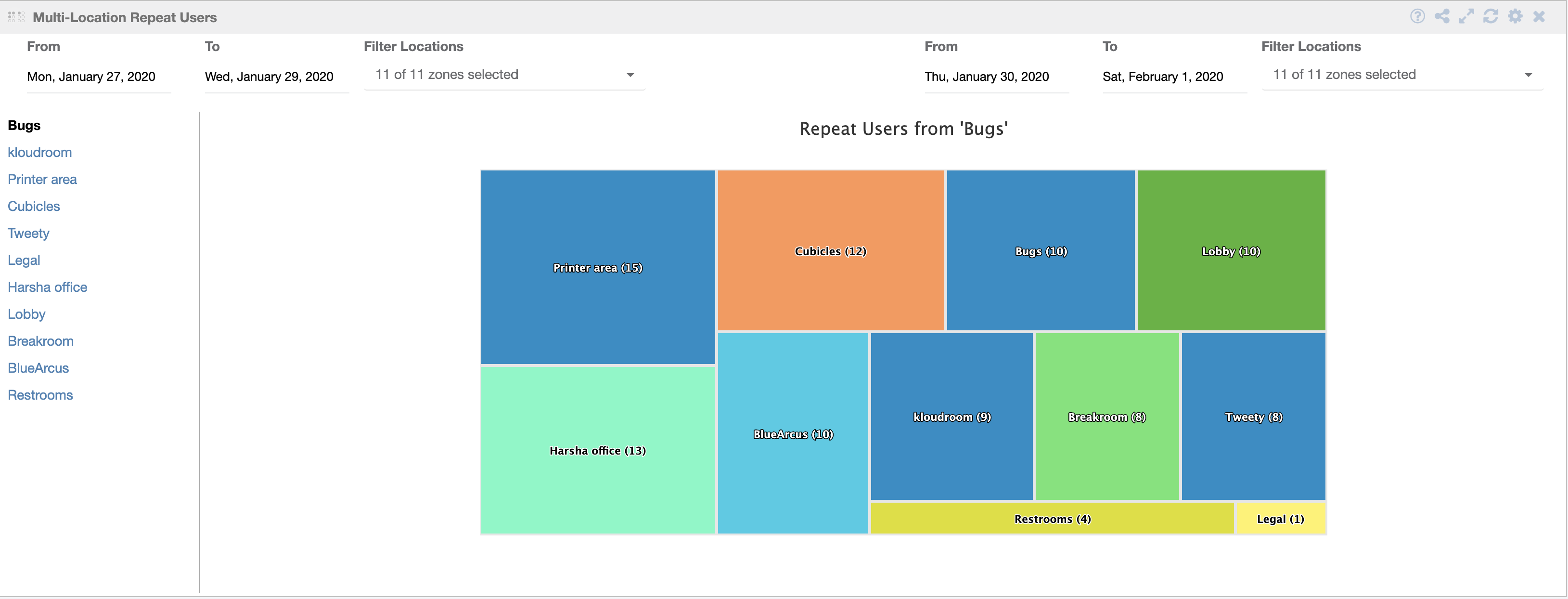
Multi-Location Repeat Users
Zone wise user count information for the selected date range and zones.
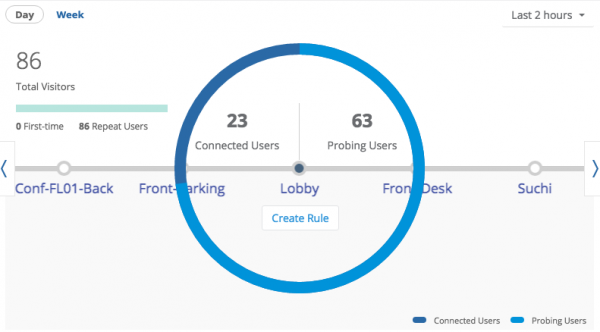
User Overview
Select a zone for information on the Connected users and Probing users.
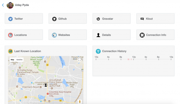
User 360
Every detail about the specific user registered in the system.
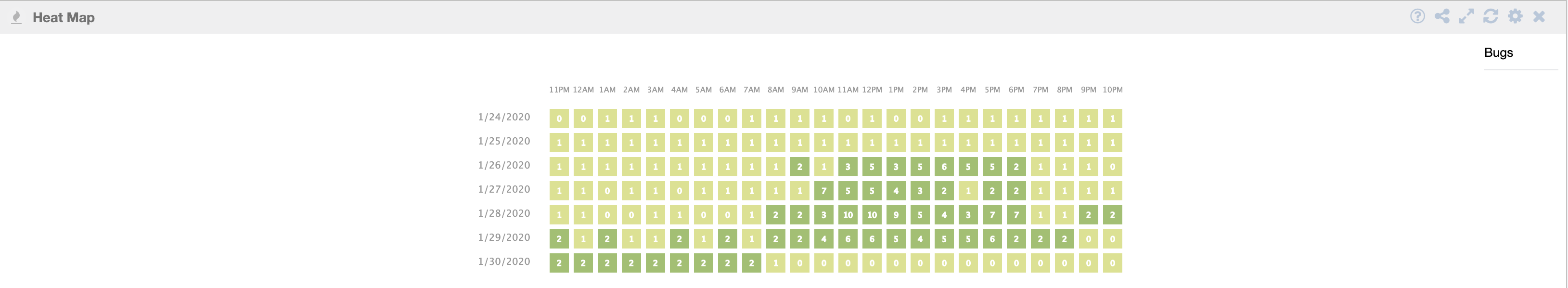
Heap Map
For a zone, shows the footfall in for every hour for the last 7 days. The color code represents, darker the color, higher usercount.
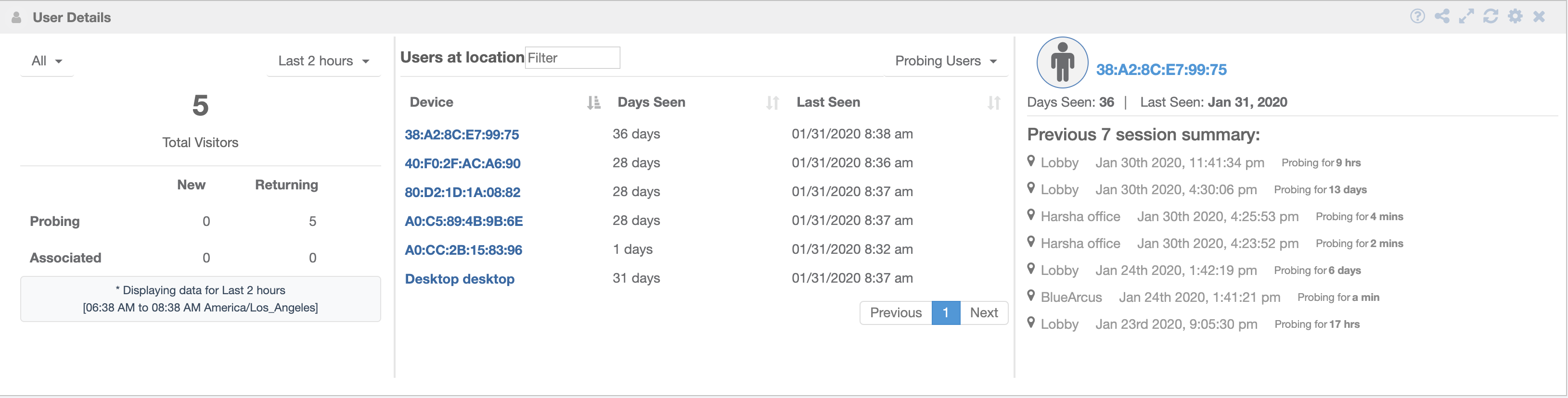
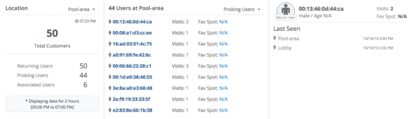
User Details
Based on the users type selected, here, ‘Probing users’. Select a user to see it’s more details like days seen, Last seen and the session summary as shown in figure below.
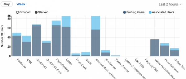
User counts by presence attributes
This bar graph is a combined information of the probing users and associated users in a zone for the selected time period.
Bluetooth Device Details
Similar to user details, shows summary of selected user.
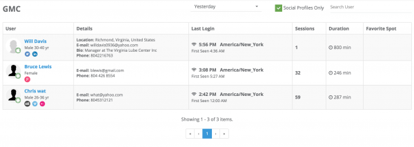
User Demographics
More detailed information of the user such as contact details, login details, etc as shown in figure below.
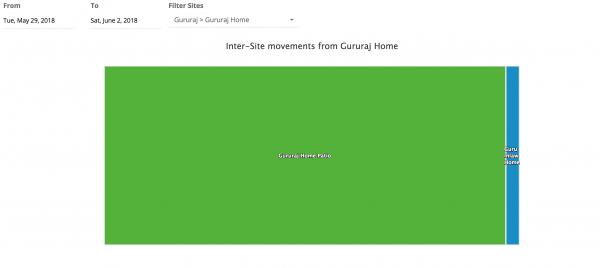
Inter-Site User Movements
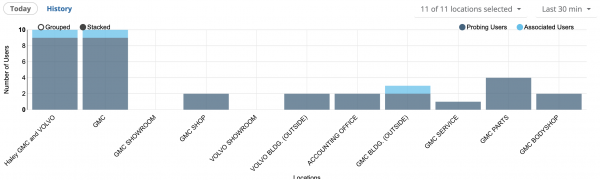
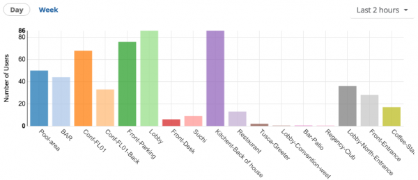
Probing/Associated Users Chart
Graphical representation of the probing and associated users for a specific zone.
Repeat Users
Graphical representation of the no. of repeated users in each zone.
Queue Wait Times
Coming Soon!
Camera (14)
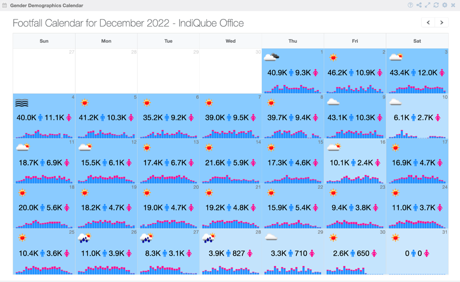
Gender Demographics Calendar
This widget provides businesses with a calendar view of user gender data as detected by cameras at a given location. By analyzing this data, businesses can gain insights into the gender distribution of their customers and adjust their marketing strategies accordingly.
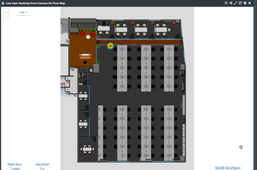
Live User Heatmap From Camera On Floor Map
The widget produces a heatmap that illustrates the density of people in a specific region, with darker colors indicating higher density and lighter colors indicating lower density. The heatmap is updated in real-time, and the widget also offers historical data. If desired, it is possible to obtain an animated representation as well.
Note: To get this, an ROI (region of interest) needs to be drawn at the point where the camera is added. Refer to the insights user manual to know how to draw it.
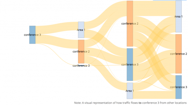
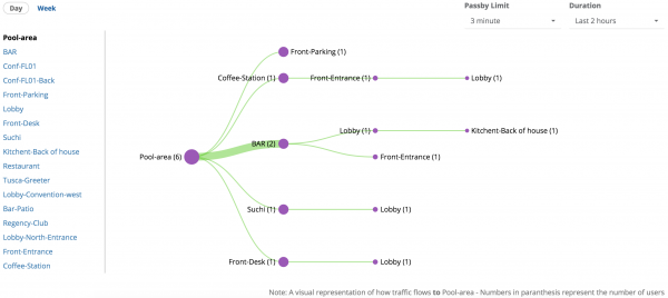
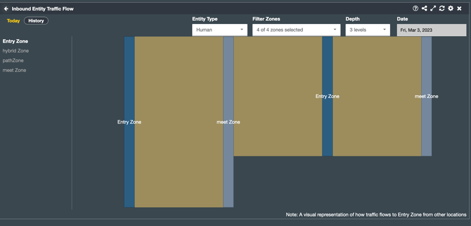
Inbound Entity Traffic Flow
1. The “Inbound Entity Traffic Flow” widget is a powerful tool for visualizing the flow of entities from different zones into a specific zone. This widget generates a flow chart that illustrates the movement of entities, such as people, or vehicles, from their origin zones to selected zone.
2. Select Entity Type from the dropdown list then select Zones, Depth, and Date.
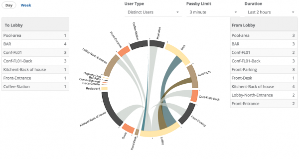
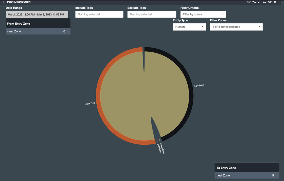
Path Distribution
The Path Distribution widget provides businesses with a chord diagram to visualize the most common paths taken by users from and to any given location. By analyzing this data, businesses can optimize product placements and signage to increase sales.
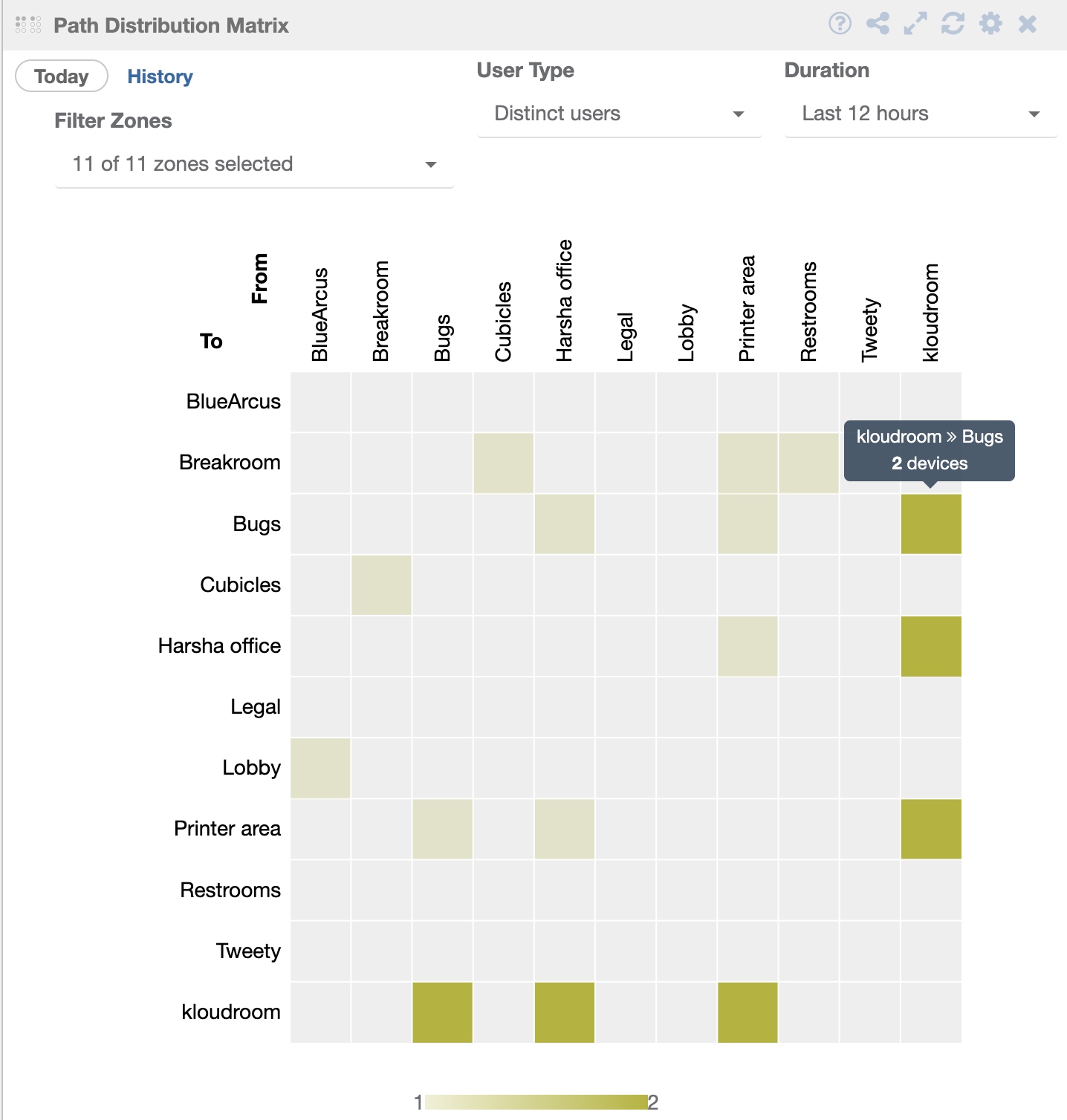
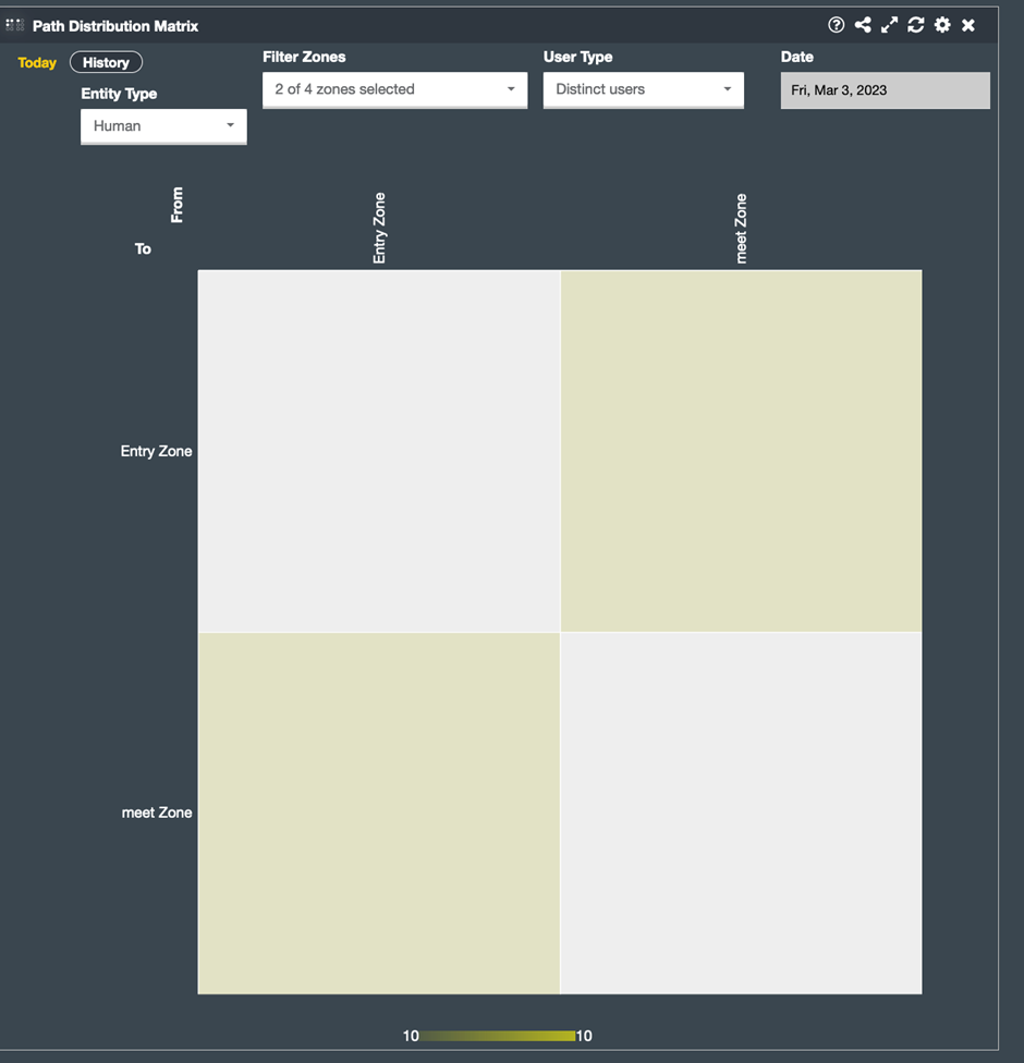
Path Distribution Matrix
This widget shows the movement of an entity from one zone to another in the form of a square chart and displays the entity count.
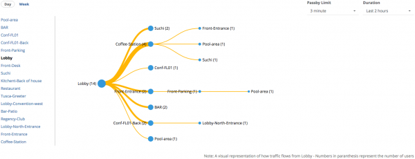
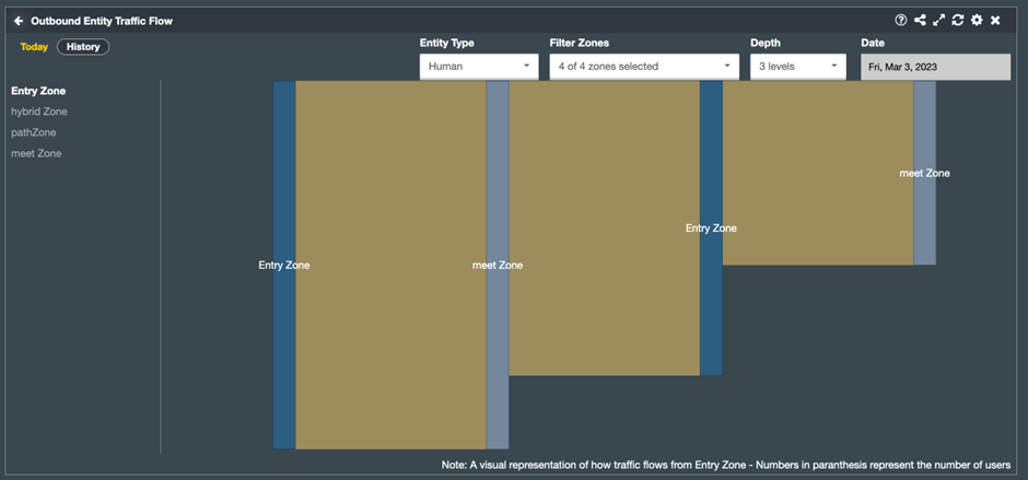
Outbound Entity Traffic Flow
The “Outbound Entity Traffic Flow” widget is a powerful tool for visualizing the flow of entities from one specific zone to another zones. This widget creates a flow chart depicting the movement of entities such as people, or vehicles from a selected zone to another zone.
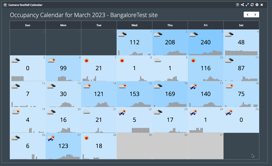
Camera Footfall Calendar
The Camera Footfall Calendar provides businesses with a calendar view of user footfall at a given location. By analyzing this data, businesses can identify peak traffic times and optimize staffing schedules accordingly.
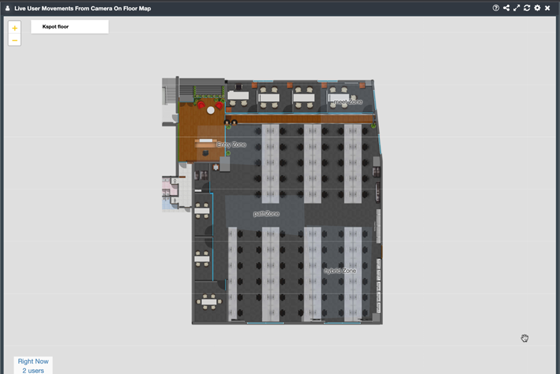
Live User Movements From Camera On Floor Map
The Live User Movements From Camera On Floor Map widget displays a
visualization of user movements on a floor map in real-time. This widget can
help businesses optimize store layouts and staffing schedules to ensure that
customers have a positive shopping experience.
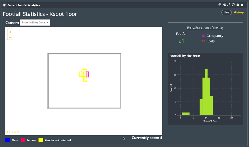
Camera Footfall Analytics
The Camera Footfall Analytics widget is a robust tool for businesses that captures data on entry/exit count, and occupancy. The widget also generates a bar chart that displays footfall information. You can select different cameras from the dropdown list.
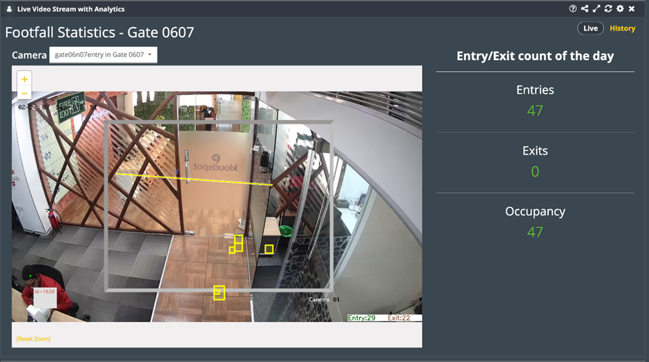
Live Video Stream with Analytics
The Live Video Stream with Analytics widget displays analytics from a selected camera. It captures data on entry, exit, and occupancy, and providing insights into how many people are entering and leaving a specific location, as well as how many people are in the area at any given time.
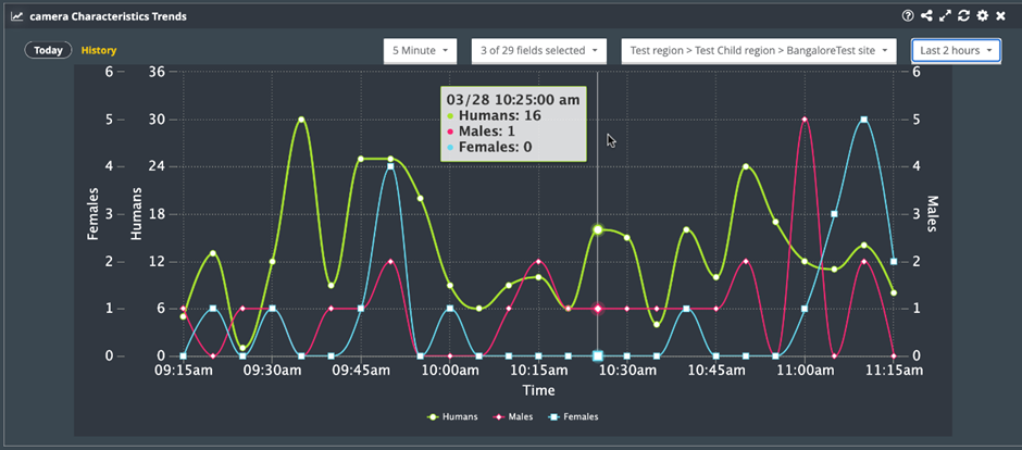
Camera Characteristics Trends
The Camera Characteristics Trend widget is a powerful tool for businesses and organizations looking to better understand the demographics of their customer base or audience. By selecting specific demographic categories such as male, female, mask, no mask, smile, or angry, the widget will generate a line chart that displays trends in those characteristics over time.
Note: If you choose additional demographic categories, the X-axis will expand to accommodate them.
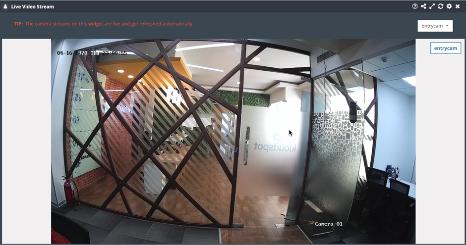
Live Video Stream
The Live Video Stream widget displays a smooth live video stream from a selected camera. This widget can help businesses monitor customer behavior in real-time and make adjustments to their operations as needed.
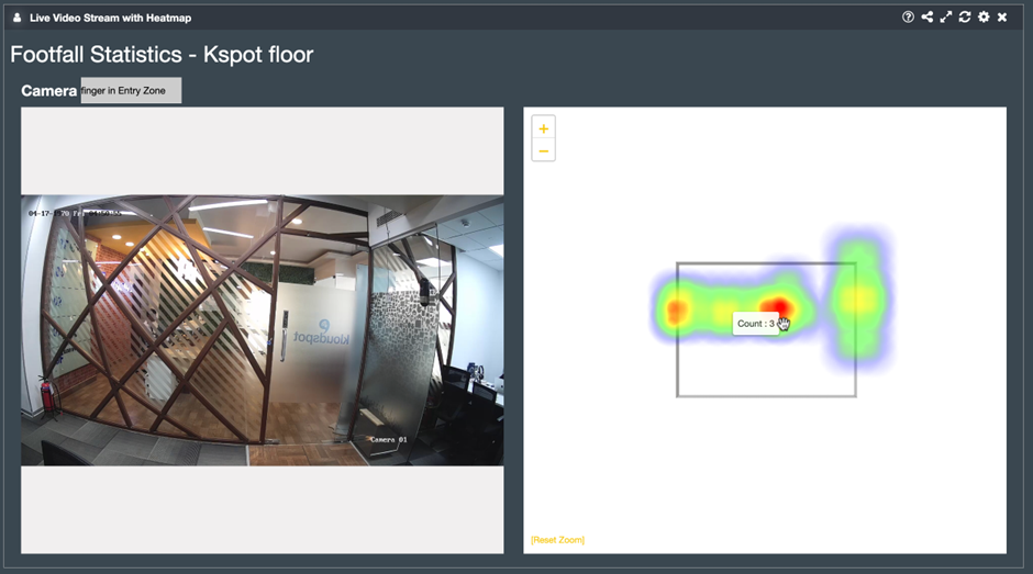
Live Video Stream with Heatmap
The Live Video Stream with Heatmap widget displays a live video stream and heatmap from a selected camera. This widget can help businesses monitor customer behavior in real-time and make adjustments to their operations as needed.
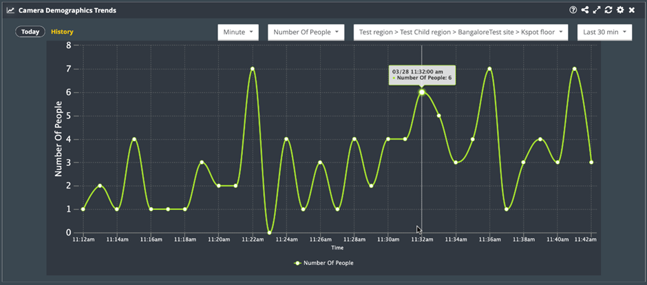
Camera Demographics Trends
The Camera Demographics Trends widget displays a timeseries chart showing the trend of user demographics and camera feature analytics over a given time period. This widget can help businesses identify trends and make data-driven decisions.
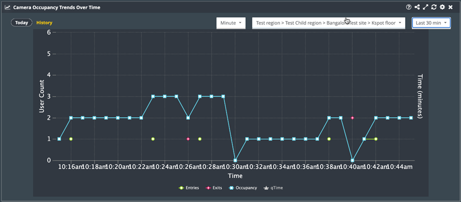
Camera Occupancy Trends Over Time
This widget is a powerful tool that uses data from Kloudvision cameras to track the occupancy levels of a queue over a given period of time. This widget provides valuable insights about the overall efficiency of the queue management system.
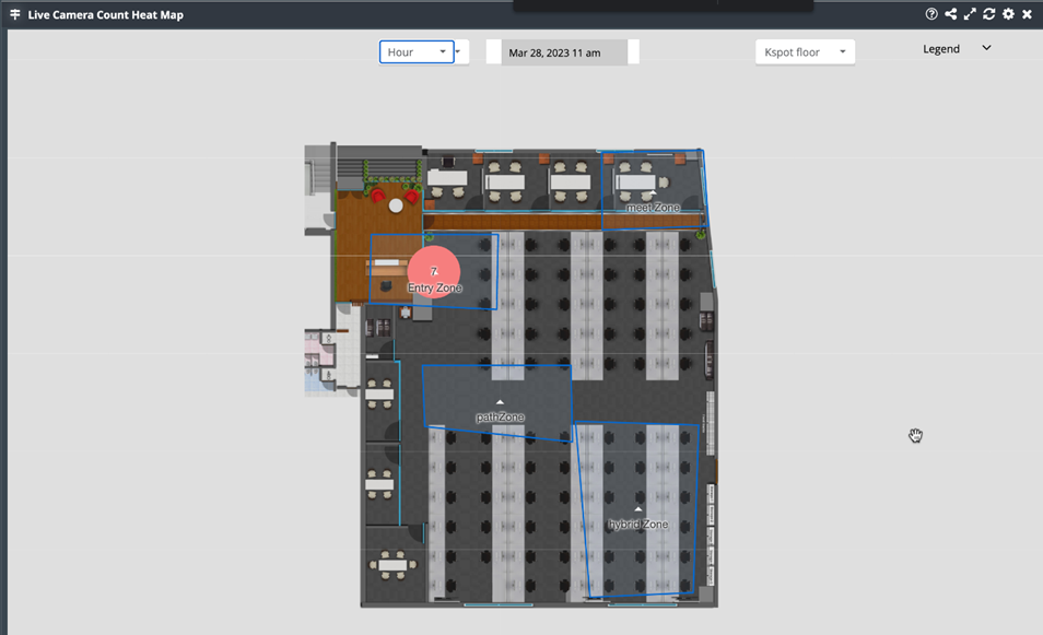
Live Camera Count Heat Map
The Live Camera Count Heat Map widget is a powerful tool that uses Kloudvision cameras to display the total number of people in a zone. This shows how many people were in a zone in the form of a heat map.
Live User Heatmap On A Floor Camera Image
The Live User Heatmap On A Floor Camera Image widget displays a visualization of user movements on a camera image in real-time displayed in the form of a heatmap. This widget can help businesses optimize store layouts and signage to increase sales.
Entity Demographics
Entity Demographics widget provides a visualization of the distribution of entities at a given location, including a brief summary of each entity’s information. This widget can help businesses gain insights into the demographics of their customers and adjust their marketing strategies accordingly.
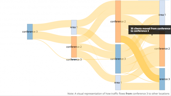
Outbound User Traffic Flow
The “Outbound User Traffic Flow” widget is a powerful tool for visualizing the flow of entities from one specific zone to another zones. This widget creates a dot chart depicting the movement of entities such as people, or vehicles from a selected zone to another zone.
Inbound User Traffic Flow
-
The “Inbound User Traffic Flow” widget is a powerful tool for visualizing the flow of entities from different zones into a specific zone. This widget generates a dot chart that illustrates the movement of entities, such as people, or vehicles, from their origin zones to selected zone.
-
Select Entity Type from the dropdown list then select Zones, Depth, and Date.
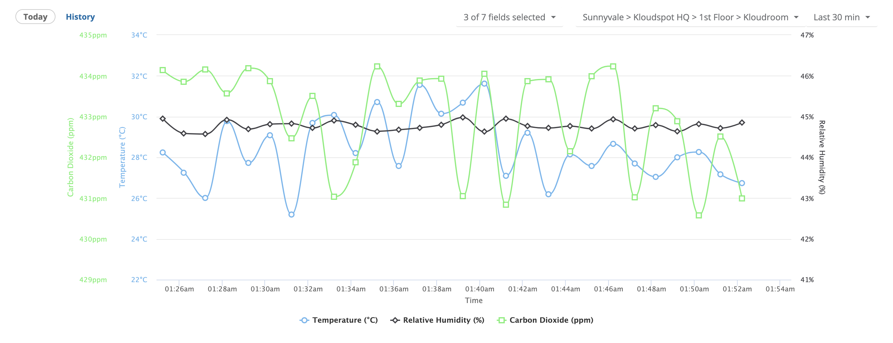
Environmental Sensors (1)
Environmental Sensor Trends
A timeseries chart displaying a trend of air quality measurements of an environmental sensor in a given time period